Newspaper coverage goes 1:1 scale

PageOneX: How newspapers tell the story proposal for the Media Lab Festival
PageOneX: How newspapers tell the story? This is how the project would look like at the MIT Media Lab Festival

[Update: there is a post with all the photos related to the installation Guns, Wars and Terrorism in a PageOneX real size (photo essay)]

PageOneX keeps moving forward. We want to have it ready for the spring, but first we have to solve a large list of bugs and other issues. A lot to code! So much coding that we sometimes forget that paper newspapers are real objects. That’s why we want to make a physical visualization of newspapers, a 1:1 scale version of PageOneX for the MIT Media Lab Festival (April 2013).

We have yet to decide the topic/s we want to focus on and when we are going to start buying newspapers. Our original plan is having New York Times, Los Angeles Times, Washington Post and The Boston Globe.

Do you have any suggestion about which topic we should follow? When to start buying the newspapers?

We are inspired by other people that have done similar displays with real newspapers that we have came across recently:

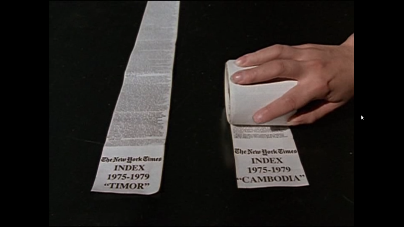
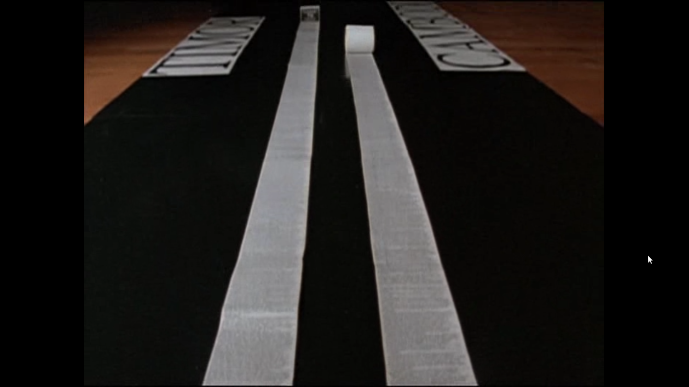
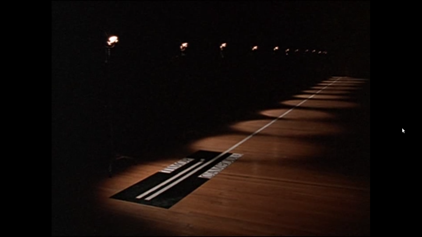
The film Manufacturing Consent: Noam Chomsky and the Media (1992) (available to watch in archive.org) by Mark Achbar and Peter Wintonick makes visual what the book Manufacturing Consent by Chomsky and Herman describes. They use as a case study the coverage of Timor war and Cambodia wars, that were happening simultaneously (1975-1979) by stitching together all the columns of text that The New York Times dedicated to each topic. Column inches is the measure that academics (and advertisers) have used to measure the amount of coverage. It was a way to show the different amount of coverage that state atrocities get, depending if they came from friend or allies states or from official enemies of the US. It is an empirical demonstration of the propaganda model.

Genocides coverage in column inches in The New York Times:

East Timor vs Cambodia news  from film Manufacturing Consent: Noam Chomsky and the Media East Timor vs Cambodia news  from film Manufacturing Consent: Noam Chomsky and the Media East Timor vs Cambodia news  from film Manufacturing Consent: Noam Chomsky and the Media

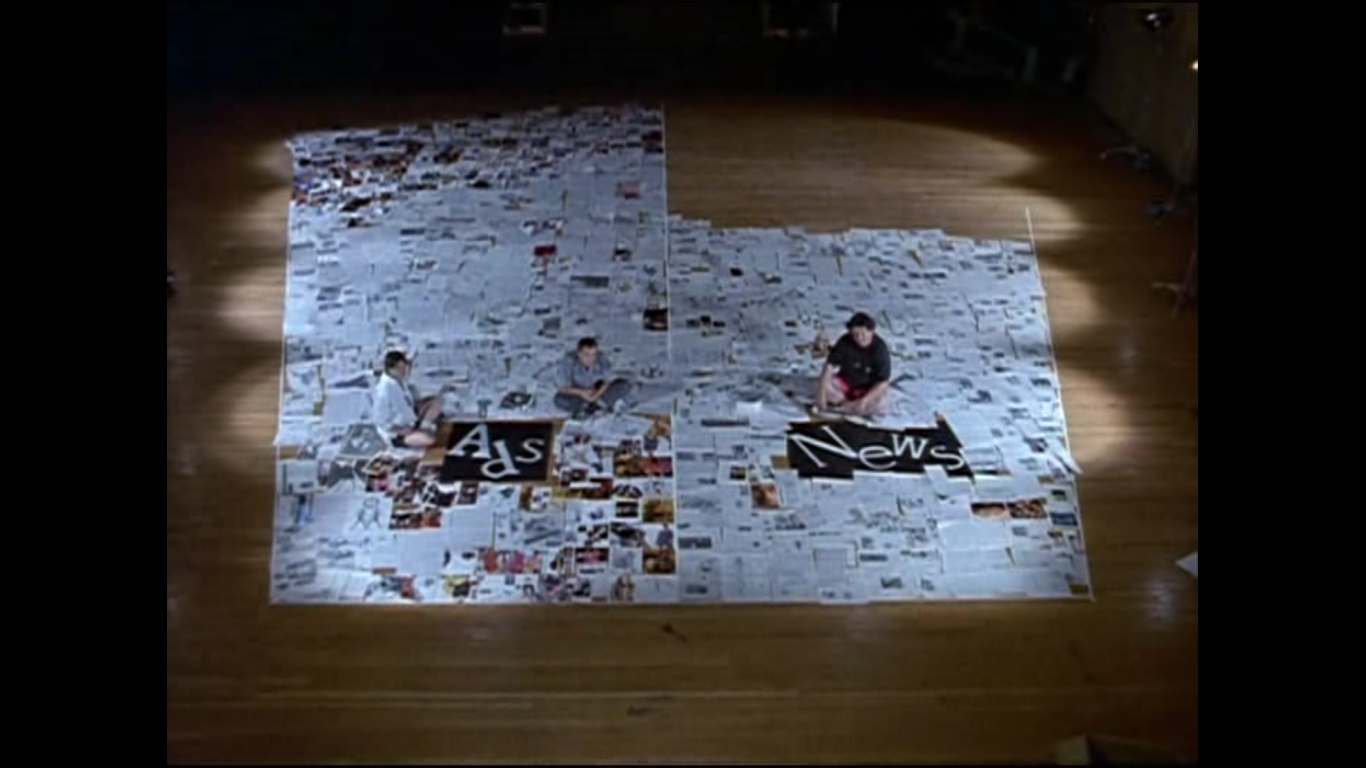
They also make a wonderful display of surface area dedicated to see the ratio of advertisement and news in a  The New York Times newspaper (we are thinking on replicating this data visualization):

Ads vs news in New York Times from film Manufacturing Consent: Noam Chomsky and the Media

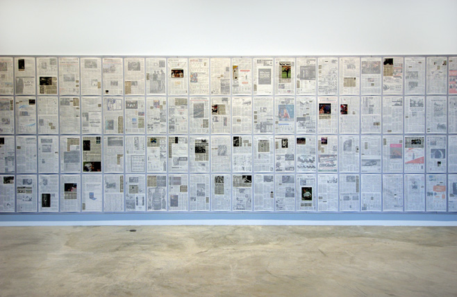
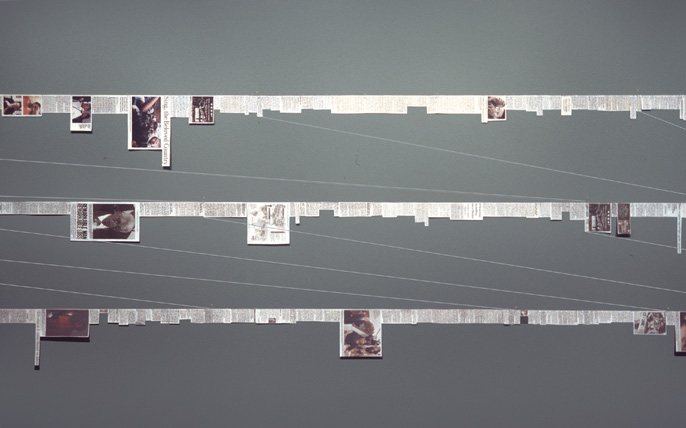
Inspired by the Manufacturing Consent film Siemon Allen made his Newspaper project. He was struck by the fact that during the same period 1975-1979 in South Africa another important event was happening “the Soweto uprisings, heightened police oppression, the expansion of separate development, and the death of many activists, including Steve Biko”. He made similar visual displays to show how was the coverage about South Africa in US newspapers:

Showing certain news in newspapers or cutting and pasting the news in long strips.

Siemon Allen Newspaper project. Hightlighing certain news
Siemon Allen Newspaper project. Cutting the news and forming strips.

He also made standard data visualization (pie charts) when he analyzed the content of the news and classified it: aids, sport, culture, crime…

Siemon Allen Newspaper project. Percentage of coverage to certain categories in The Wahington Post.
Siemon Allen Newspaper project. Percentage of coverage to certain categories in The Washington Post.

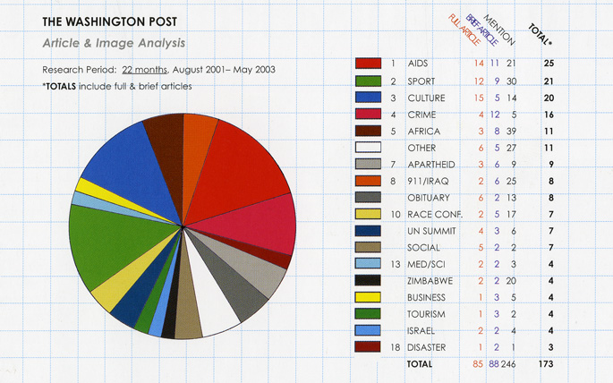
Note: The photos from the film are screenshots I took. The Siemon Allen images are all extracted from his website.


3 steps to measure the corruption coverage in Spain

The fast-growing list of corruption investigations in Spain have involved almost every institution in the country: the major political parties, the royal house, the supreme court or the national bank, just to mention some of them. Everyday, new information and a new case is released/unveiled, provoking an increasing sense of indignation. It is also true that the levels of indignation have reached an apex, that they cause either incredulity or insensitivity.

I decided to test PageOneX, a tool to visualize the evolution of stories on newspaper front pages, to see how the coverage on corruption was being made. It is a good moment to do so, now that we, at the Center for Civic Media, are currently developing it. We hope to have a fully functional version by the end of the month, but you can always test the online alpha version or install the code locally. You can also get involved in the testing and development, it is open source.

This post is based on another I wrote in Spanish Es lo mismo pero no es igual in my blog.

1. Corruption or not corruption?

The hypothesis and common ground knowledge is that every Spanish newspaper is usually  aligned with a political party. They usually  follow the corruption cases of the ‘opponent’ parties. Measuring the coverage in the front page seemed a good proxy to analyze their political agendas and to verify the hypothesis.

I selected 9 Spanish newspapers and highlighted the stories related to corruption cases in the last days until February 5th, 2013.

130205_corruption-spain-pageonex

There are two big ‘black’ clusters: after Jan. 17th, when El Mundo published that the ruling party ex-treasurer, Bárcenas, had a $29 million swiss account, and after January 31st, when the excerpts from the party’s parallel financial accounts were published by El País. Both scoops drain all the other newspapers to talk about the same PP corruption case.
Continue reading

Es lo mismo pero no es igual

[Actualización del 4 febrero 2013: puedes ver más abajo la versión actualizada.]

Ayer publiqué la cobertura en la prensa española de casos de corrupción, pero hacía falta un análisis cualitativo para entender en qué tono estaban escritas las portadas. Creo que llevaba a error pensar que cuando todos los periódicos hablaban de lo mismo decían lo mismo: unos defienden y los otros atacan o simplemente informan. Algo parecido hice sobre las movilizaciones sociales del mayo pasado cuando clasifiqué según las noticias eran informativas o editoriales en primera página sobre el 15M.

leyenda-cualitativo

Esta vez he hecho una nueva taxonomía: artículo que defienden o valoran positivamente la actuación de un partido político y los que dan la información de manera más neutra o negativa. El umbral entre uno y otro es subjetivo, así que el criterio ha sido incluir solamente los casos en los que veía claro que eran una defensa o valoración positiva de una determinada noticia.

130203_enero2013-corrupcion-cualitativo-pageonex

Se puede apreciar cómo la valoración positiva o defensa (área rayada en diagonal) es, básicamente, de los periódicos más conservadores (ABC, La Razón y La Gaceta) que defienden la actuación del PP. Hay varios métodos: dar razones para situar a Bárcenas fuera del PP o  apoyar los proyectos pro-transparencia de Mariano Rajoy y otros miembros del partido.

ABC, La Razón y La Gaceta coinciden también en dedicar al menos una portada a la ‘corrupción’ en genérico (área morada en el gráfico) en los cinco días posteriores del 17 de enero, que es cuando El Mundo publicó la noticia de los 22 millones de Bárcenas en Suiza. Es la táctica del “y el resto también”. El caso Bárcenas es demasiado grande como para ignorarlo, así que deben emplear otras tácticas diferentes de la del “avestruz” o el “y tú más”.

Continue reading

Cobertura en la prensa española de casos de corrupción

16:02h. 3 febrero 20013. Hay una actualización de este gráfico en Es lo mismo pero no es igual.
2013enero-corrupcion-pageonex-c

El mes de enero ha estado cargado de noticias de diferentes casos de corrupción que han afectado a los principales partidos políticos y a la casa real: Nóos, Pallerols, Baltar, Amy-Mulas, Gürtel, Pokemon, Lloret de Mar, Bárcenas… Es una oportunidad idónea para comprobar de una forma visual cómo cada periódico se alinea con un determinado partido o en contra de otro.

El mes tiene un marcado color azul (PP) por la cobertura de todos los medios del caso Bárcenas, pero también hay naranja (CiU) que con Pallerols y Lloret hacen doblete, rojo (PSOE) con el caso Amy-Mulas y el verde (Casa real) de Urdangarín y su Instituto Nóos. La cobertura es bastante desigual salvo cuando todo el coro canta al unísono en los estribillos del caso Bárcenas.

El método utilizado analiza las portadas de prensa y mide el porcentaje del total que dedican a una determinada noticia. De cada portada se han seleccionado las dos noticias relacionadas con las corrupción más importantes.

elpais-pageonex

El País tiene una trayectoria constante: azul PP con algunos pequeños toques verdes Urdangarín y Revenga. Se mantiene constante su cobertura (10-20%)y, cuando llega su scoop, da toda su portada a los papeles de Bárcenas subrayados. El rojo PSOE no aparece por ningún lado, y los tejemanejes de Nóos y Urdangarín están pero en tamaño pequeño.

abc-pageonex

ABC, por las características de su portada con una imagen que lo ocupa casi todo, tiene siempre mayores porcentajes, superando a menudo el 50% de cobertura, hable del tema que hable, Es binario, o blanco o negro. Después de la aparición de la cuenta en Suiza de Bárcenas (17 de enero por El Mundo) le dedica dos portadas seguidas al tema, para luego hacer una, el día 20 de enero (morado), con un fotomontaje de corruptos de toda condición. Al siguiente, para compensar, saca a Griñán y sus EREs. Cabe señalar que cubrir una noticia de corrupción no significa que se esté criticando al partido en cuestión: el 22 de enero titula “Luz y taquígrafos” para anunciar que Rajoy realizará una auditoria externa e interna para “zanjar especulaciones”. Cerca del final dedica toda la portada a la fianza para los de Nóos, y cierra, como todos, con Bárcenas y sus papeles.

elmundo-pageonex

El Mundo es el más multicolor: le da a todo. Desde después de reyes no hay día que no hable de algún caso de corrupción. Al principo con naranja CiU, luego llega el periodo azul con la cuenta de Bárcenas en Suiza, toques de rojo con Amy-Mulas del PSOE combinados con verdes Nóos al final. Al final vuelve a los papeles de Bárcenas empujado por la exclusiva de El País.

Nota: se ha dejado fuera del estudio el caso de la caja NovaGalicia y el conflico del Banco de España.
La visualización se ha realizado con la herramienta PageOneX, actualmente en estado de desarollo.


Three updates about PageOneX: How to Heroku, mail list and users start using

Three updates about the PageOneX:

Pasando del papel: portadas post #14N en medios digitales

El siguiente objeto de estudio serán las portadas continuamente cambiantes de los medios en internet. Las portadas tradicionales, las “de papel”, tienen el interés de ser una condensación en espacio limitado del contenido editorial de un periódico. Son el lugar donde pueden ‘gritar’ y saber que serán escuchados, saldrán por la tele y serán retuiteados.

Sin embargo, en un ecosistema mediático donde las cabeceras digitales ganan cada vez más poder, parece lógico prestar también atención a los periódicos online ¿cada cuanto habrá que programar el crawler para que capture la pantalla? ¿imagen o html? ¿todo o una parte? Seguramente habrá que capturarlo todo y luego ver qué nos vale.

Aquí una muestra de algunos de los periódicos online del día después de la huelga general del #14N, entre las 1.15 y las 2.15 de la madrugada de España.


Método utilizado: zoom al 67%, print screen y recortar los banners de anuncios superiores y laterales. Se queda mucha página sin grabar, pero creo que es también relevante ver qué pasa above the fold ¿cuantas pantallas son eso online?

PageOneX: timeline for a work in progress


I’ve been reorganizing all the material related to PageOneX in this timeline, made with the amazing TimelineJS. The idea is to move forward and have a first beta version, the alpha is having too many bugs, report them if you see some!

Find more info about the project at pageonex.com

For better navigation you can see a full screen view of this timeline.

Coding online is easier: help PageOnex find its bugs!

Now, coding newspapers front pages is easier than ever. You don’t need to have any programming skills to do it.

Not so long ago I was uploading my first script in github that allowed others to go to the process of scraping, downloading and scraping front pages of newspapers. It was kind of complicated, and almost no one did it until the end (thanks Ahmd). You needed to run it in Processing, and code it in Inkscape.

Half a year later, after a busy summer working with Ahmd, we can present a beta version of the online version of PageOneX (http://pageonex.herokuapp.com) We’ve launched it in heroku, before its definitive deployment at pageonex.com

Report bugs and suggestions
Try to create your own threads and report bugs at http://bit.ly/pageonextest

Find more info about the project in the PageOneX blog or fork the code https://github.com/numeroteca/PageOneX-ruby https://github.com/numeroteca/PageOneX

In the following images I am comparing the “old” method with inkscape whit the new one.

Compare the old a new tools
Below you can compare the two methods applied to this thread about the #15M mobilizations, indignados movement, on May 2011.

The PageOneX online method (runs on Ruby on Rails)
http://pageonex.herokuapp.com/users/Pablo/threads/15m_social_mobilizations

The former method (runs with Processing and Inksacape) https://github.com/numeroteca/PageOneX
In this case also twitter data are included.

PageOneX, ready steady go!


View this datavis full size at gigapan and the related post about May 2012 social mobilizations in Spain.

Today’s post is to present the tool we are building this summer: PageOneX. The idea behind is to make online and easier the coding process of front page newspapers. Make  this visualization process available for researchers, advocacy groups and anyone interested. I’ll will give some background about this process.

How things started
Approximately one year ago I started diving in the front page world. It was days after the occupations of squares in many cities from Spain, and I was living in Boston. I made a front page visualization to show what people was talking about: the blackout in the media about the indignados #15M movement. You can read more about Cthe story in the ivic Media blog. Since then I’ve been making more visualizations around front pages of paper newspapers, testing different methods and possible ways to use them. I’ve also made a tool, built in Processing, to scrap front pages from kiosko.net and build a .svg matrix.


PageOneX: first tool
Before starting with the new tool, I’d like to present the present one I’ve been using this past moths:  a semi-automated process with Processing and Inkscape. The code is available at https://github.com/numeroteca/pageonex-processing https://github.com/numeroteca/PageOneX.

The process is segmented in two main actions: 1. Get the front pages and 2. Code articles.

  1. Get the front pages
    Open the pageonex.pde file and open it in Processing:

    1. Select newspapers and starting and end dates (be aware of adjusting the size of the newspaper)
    2. Run the program to scrape front pages from kiosko.net. It automatically downloads them.
    3. It will construct the matrix of front pages in a .svg (Scalable Vector Graphics) file.
  2. Code articles
    1. Open the matrix.svg in Inkscape. It is a file with 3 layers:
      1. Highlights (multiply option to show transparency)
      2. Filter to make images look lighter.
      3. Images of front pages.
    2. Now highlight by hand the news we want by drawing rectangles (merging of rectangles for news with non-rectangular shapes) on the news.
    3. Export the file to a pretty .png file

That was the process until now. It works, but it is not easy for not tech savy people: you need to have Processing installed, change the parameters and be able to ‘play’ with Inkscape at an intermediate level. That is how we decided to make this tool online, to broaden its use.


PageOneX.com
PageOneX.com (now temporary redirected to this blog) is an online platform for analyzing and visualizing coverage of news in newspapers’ front pages. We’ll be coding this summer to have at least a part of the tool available by August-September. We’ll be having some beta tests, so if you are interested, just ask for it! The idea is to open a co-design process where future users take part in the design of the tool.

Why analyzing front pages? Some ideas behind the project:


1. 

It seems that analyzing front pages  is a good method, a shortcut to follow how news are being covered in the media. Front pages are a very special piece of the media ecology: newsrooms spend a lot of time deciding what goes in their A1, fighting which news have to be in their page one.

2. 

With this kind of visualizations we are able to show the data and the analysis at the same time. We can show in a bar chart quantitative data regarding the coverage, but also the data source it self: the front pages. We want to offer a visual and direct way to visualize all the coding. Check the The Global Media Monitoring Project Report methodology to see which other interesting  approaches to this coding process. We have tested with Gigapan the possibility of exploring this huge graphics, to be able to read the newspapers and also have a sense of the whole data visualization.


3. 

We’ll be using the percentage of every front page, instead of the actual size: it will allow us to compare newspapers with diferent sizes as we did with this example of US and Spanish newspapers covering the Japanese Tsunami in 2011.

Here there are slides about the project and basic draft for the User Interface.


Arab Spring, Spanish Revolution, and Occupy Movement: Mainstream Media vs Social Media coverage

The project is incorporating new collaborators: Ahmd Refat as coder, thanks to the Google Summer of Code programmSasha Costanza-Chock and Nathan Mathias from the Center for Civic Media at MIT Media Lab. Nathan is developing is also developing Mediameter with more people at the Center for Civic Media, we might be using their framework to build our tool and not start from scratch. Mediameter is used for crowd-source analysis of articles. We are also looking at Mapmill by Jeff Warren, built in Ruby on Rails, as it is a system to code  image as well.

Stay tuned!


Portadología

Últimamente no paro de ver artículos y posts sobre portadas de prensa:

Creo que el tema se merece un análisis sobre la cirsis española en la prensa internacional y/o uno sobre españolidad en las portadas de La Razón vs. ABC.

Las portadas del #12M15M: silencios y gritos

Hace un año fuimos actualizando el seguimiento de la prensa sobre el #15M a medida que pasaban los días. Aquí presentamos el gráfico actualizado del pasado domingo a día 16 de mayo. Tras el día 14 de mayo El País no ha vuelto a publicar nada en su portada sobre el tema, mientras que La Razón, El Mundo y La Gaceta han publicado noticias o editoriales negativas sobre el #15M. El ABC mantiene su silencio.

En en este segundo gráfico volvemos a diferenciar en dos colores diferentes para entender de qué están halando las portadas de un solo vistazo:

  • verde: noticias informativas (valga la redundancia)
  • rojo: noticias-editoriales de caracter negativo sobre las movilizaciones

Sin embargo, aunque desde el lunes el #15M no apareció en la portada de El País en papel y perdió su lugar prominente en la portada digital sí que mantuvo su cobertura en streaming durante los cuatro días ¿decisión editorial? Lo bueno es que ahora El País permite navegar por sus portadas digitales a través de su hemeroteca. Por otro lado, y basado en lo que fui ojeando, todos los periódicos cubrieron en sus versiones digitales las diferentes  movilizaciones, principalmente las de Madrid y Barcelona.

En cualquier caso es reseñable cómo La Razón ha mantenido su dedicación a las movilizaciones y cómo ha sido especialemente insistente en el uso de la marca “15-M” para atraer la atención. Esto me recuerda a Intereconomía, que parece que aumentó su audiencia el pasado #15M gracias a su especial cobertura del evento.

Aquí los recortes de las portadas de La Razón del 13 al 16 de mayo de 2012 en donde aparece 15-M. Creatividad al poder.

13 de Mayo 2012
14 de mayo 2012
15 de mayo 2012
16 de mayo 2012

Social media /Redes sociales en Internet
Hace un año añadimos el seguimiento en Twitter para comparar la influencia-repercusión en los ‘mass media”  y en los ‘social media’. Ahora hemos usado diferentes métodos de captura de datos por Twitter y estamos comparándolos. Pronto compartiremos los resultados y los integraremos en este gráfico. De momento puedes seguir aquí los resultados preliminares: #12m15m.

Continue reading

Las portadas de mayo, del 1 de mayo al #12M15M

En las portadas de la prensa española se está reflejando de muy diferente forma las movilizaciones sociales. En el caso del mes de mayo hemos tenido el primero de mayo, movilizaciones estudiantiles y el  #12m15m (aniversario del #15M). He recopilado aquí la superficie que han dedicado en sus portadas los diferentes periódicos. La visualización parece confirmar el análisis de Sáenz de Hugarte:  la estrategia de La Razón es la de configurarse como un actor (a la contra) en el debate sobre las movilizaciones -y de paso llevarse unos Trending Topics-, mientras que el ABC opta por obviarlas. El País y El Mundo tienen un seguimiento similar, a ver qué pasa en los siguientes días.

En el segundo gráfico diferencio qué es lo que se dice en cada una de esas portadas. Lo he dividido en dos grandes apartados:

  • verde: noticias informativas (valga la redundancia)
  • rojo: noticias-editoriales de caracter negativo sobre las movilizaciones

Vuelven las portadas #primaveravalenciana

No es que se hubieran ido, pero acaso porque esté yo más sensible al tema, no paro de ver noticias que hablan de portadas y más portadas de prensa. Ese elemento que los periódicos de papel se reservan para dar su grito, y que es comentado en la radio, televisión, webs y redes sociales de internet. Parecía que Inernet iba a matar pronto a al papel, pero las portadas en papel siguen teniendo su audiencia y se resisten a ser borradas del mapa mediático. El periódico Público acaba de perder su lugar en el kiosko (25 de febrero), y el gráfico por lo menos sirve para dejar ver el hueco que deja, que acrecienta el desequilibrio entre medios de comunicación qde derecha e izquierda en España.

En el gráfico de arriba se relaciona la superficie dedicada en las portadas de prensa española a la llamada “primavera valenciana” en relación a los twits con el hashtag #primaveravalenciana. Las manifestaciones y cagas policiales comenzaron el 15 de febrero, pero hasta el día 21 no se convirtieron en primera página para la mayotía de diarios. El lunes 20 #primaveravalenciana llegaba a su pico y era trending topic, cuando se detuvieron a 26 personas tras las manifestaciones en Valencia. Un análisis posible sería ver de qué hablaban y cómo estas noticias para aportar no solo cantidad (superficie) sino un análisis cualitativo. Estamos pensando aplicar la metodología que usó Victor Sampedro Blanco en su análisis de la prensa sobre la insumisión en los años 80-90 en España y cómo se configuran las agendas políticas y mediáticas. Todo llegará.

Para no deternos ahí y seguir analizando otros elementos interesantes de los movimientos sociales en febrero, hemos incluido las noticias relacionadas con la reforma laboral, los sindicatos y la manifestación del 20 de febrero. También aquí podríamos diferenciar entre los diferentes tipos de noticia. Valga por el momento esta prueba. Se incluyen los twits con la palabra “reforma”.

Con este gráfico queremos retomar el estudio de las portadas en la prensa para ver cómo configuran la agenda política y social y cómo se relacionan con los movimientos sociales. (Nota: Faltan por incluir, las portadas relacionadas con las protestas en Atenas).

Noticias y post con portadas de por medio:

Así que parece que las portadas tienen cuerda para rato.

Frontpage analysis tool in github

I’ve just uploaded to Github (opensource repository) the tool (in Processing) to scrap, download and build the matrix of newspapers frontpages: https://github.com/numeroteca/PageOneX Update 13.11.12: Renaming https://github.com/numeroteca/pageonex-processing Feedback welcome. See examples. By the way, this is the first “aside” of this blog.

Comparison in US and Spanish Newspapers’ front pages about Japanese Tsunami

Here we compare how newspapers in US and in Spain cover the Japanese Tsunami (March 2011).
The aim of this comparision is to see:

  • How different coverage they have towards international news.
  • How long one single event (news) last in time.
  • Spanish newspaper have less news per front page, they are more what are called her “dailys”: smaller in size and elongate format.
    See table bellow. How that affects the use of front page space.

Table: Number of news in the front page of main Spanish and US newspapers
See full table and data.

Example:
Name:  average of number of articles per front page

Spanish
El País: 7.5
El Mundo: 7.5
ABC: 4.5
La Vanguardia: 5.1
La Razón: 4.9
Público: 4.6

USA
WSJ: 34.8 (28,0 short news)
The Washington post: 13.1
The New York times: 15.5
The Boston Globe: 17.7 (9.2 short news)
USA Today: 13.0
Los Ángeles Times: 9.7

Source: data extracted from a random period of 21 days.
The chart. See the data behind in the spreadsheet:

Surface coverage in Spanish newspapers’ front page about the Arab Spring

Here the interactive version of the graphic about  Egypt, Lybia, Syria and other protest-revolutions.

This is a data visualization made for the Instituto de Estudios sobre Conflictos y Acción humanitaria.

Puedes leer el artículo de análisis de iecah.org en Estudio de la cobertura periodística sobre las revueltas árabes.

Nota: El porcentaje dedicado está calculado considerando que las portadas de los diferentes periódicos tienen el mismo tamaño, aunque en la realidad cada diario tiene diferente tamaño, y por tanto, diferente superficie total.

Fuentes: las imágenes de las portadas han sido obtenidas de kiosko.net.

Surface in Newspapers front pages vs. Twitter about #ows #Occupy Nov 30th

We keep making experiments with this small multiple graphic. We are now displaying the percentage of surface that #occupy is ‘using’ in the front pages of the newspapers, as making quantitative reading of surfaces is difficult for the human eye. Red bars are displaying the % of surface ‘occupied’ in the front pages.

The blue line is the number of twits with the hashtag #OWS. For the moment we only have available data from twitter from October 6th 2011. The  data from Twitter are from r-shief.org who are promoting  an #OccupyData Hackathon for this Friday December 9th. Find more information and join us at http://bit.ly/occupyhackathon. We will be having local sessions at the MIT Media Lab and a lecture-conference with the researchers of this investigation about Twitter and #spanishrevolution and #15M from Spain.

We are also thinking which is the best way to show simultaneously the raw data from the front pages, it’s percentage and the twits. Which vertical scales to use? number of twits by day? by the hour?

I will have more updates about this #FrontPageAnalysis project, that is still looking for a name. We have developed so far a script in Processing to generate the array of front pages.

You still can view the kind of graphic we’ve been using in the last weeks, with the twitter statistics from Trendistic.

Trendistic: http://trendistic.indextank.com/occupywallstreet/occupy/ows/occupyoakland/occupyboston/occupyla/_since-2011-09-17-00h-utc/_until-2011-12-01-00h-utc

Superficie dedicada en las portadas de periódico al #15M versus Twitter 15M-19J

Not including #acampadabcn to not distort too much the graphic. See following graph.

Trendistic: http://trendistic.indextank.com/15m/acampadasol/acampadabcn/nonosvamos/spanishrevolution/19j/_since-2011-05-15-01h-utc/_until-2011-06-23-06h-utc

Surface dedicated in Newspapers front pages vs. Twitter about #Occupy #occupywallstreet #occupyBoston #ows #occupyoakland Oct 31st

Twitter source:

http://trendistic.indextank.com/occupywallstreet/occupy/ows/occupyoakland/occupyboston/occupydenver/_since-2011-09-17-01h-utc/_until-2011-10-31-19h-utc

Surface dedicated in Newspapers front pages vs. Twitter about #Occupy #occupywallstreet #occupyBoston #ows #occupyoakland Oct 26th

Let’s see what they say about occupyoakland’s eviction tomorrow’s newspapers!

Meanwhile, here the twitter statistics:  http://trendistic.indextank.com/occupywallstreet/occupyboston/occupyoakland/ows/occupy/_since-2011-09-17-05h-utc/_until-2011-10-26-21h-utc


Surface dedicated in Newspapers front pages vs. Twitter about #Occupy #occupywallstreet #occupyBoston #ows Oct 24th

Twitter graphics extracted from http://trendistic.indextank.com/occupywallstreet/occupyboston/occupy/ows/_since-2011-09-16-21h-utc/_until-2011-10-25-01h-utc

Surface dedicated in Newspapers front pages vs. Twitter about #Occupy #occupywallstreet #occupyBoston #ows Oct 17th

It looks like the after the arrests in occupy Boston, The Boston Globe is covering it in its front page everyday.

Interesting also that there was not that much coverage about the rallies all around the globe on Saturday October 15th #15O.


Superficie dedicada al #15m en portadas del 15M al 19J v1.2


Hemos añadido algunos eventos relevantes apra ayudar a leer el gráfico. Estamos mirando la posibilidad de hacerlo en vertical… pero no sé si mejorará la visualización.

Puedes descargarte aquí la versión a un tamaño todavía más grande (16Mb), se leen mejor las portadas.

Nota: las portadas del 3 y 4 de junio del periódico Público están repetidas. Esperamos corregirlo pronto.

Superficie dedicada #15m en portadas y Twitter v2.0

Se compara la superficie ocupada por el tema #15m en la portada de los periódicos con los twitts con los hastags #15m #acampadasol y #spanishrevolution (actualización respecto de la versión 1.1).

Las imágenes provienen de kiosko.net y los gráficos de los twitts de trendistic.com.

Superficie dedicada #15m en portadas y Twitter


Se compara la superficie ocupada por el tema #15m en la portada de los periódicos con los twitts con los hastags #15m #acampadasol y #spanishrevolution.

Las imágenes provienen de kiosko.net y los gráficos de los twitts de trendistic.com.

Puedes consultar una versión mejorada de este gráfico.