This article will be part of the forthcoming book Accountability Technologies: Tools for Asking Hard Questions edited by Dietmar Offenhuber and Katja Schechtner. It is based on previous published texts about PageOneX. It wants to be a short summary of the possibilities of the tool that has just been released: PageOneX.com
There is an article in preparation with Sasha Costanza-Chock that will provide a review of scholarship in this area (print newspaper coverage) and will describe our approach in-depth to the topic.
Newspaper Front Page Analysis: How Do They Tell the Story?
1. Introduction
Social Networking Sites (SNS), especially Twitter and Facebook, have played an important role in the current global social movement wave, from the Arab Spring to the Occupy movement in the United States. Social movement actors use SNS, among other tools, to document, promote, support and, in some cases, to coordinate movement activity. SNS have also become key sources of information for observers, both supporters, detractors, and non-participants, as well as for professional journalists working within print, broadcast, and online media, whose reporting strategies have, in some cases, shifted towards curating and incorporating content first circulated via SNS. In the context of increasingly transnationalized media firms and cross-platform convergence, information rapidly flows back and forth between SNS and mass media.
Print newspaper coverage also has an impact far beyond paid subscribers or readers, since it greatly influences broadcast (television and radio) news agendas; newspaper coverage also plays an important agenda-setting role for blogs and social media. The complexity of the converged media ecology requires new approaches to newspaper content analysis, which has long been used by social movement scholars as a proxy for social movement activity. This essay describes an innovative approach to the analysis and visualization of front page newspaper coverage.
2. Background: How Did I Start Coding Front Pages?
On Sunday May 15th, 2011, one week before the municipal elections that were taking place all around the country, there was a grassroots-organized march in many cities in Spain under the motto “Real Democracy Now” (Democracia Real Ya[ref]Democracia Real Ya was not only the motto, but also the citizen platform to deepen in democratic values http://democraciarealya.es[/ref]). By then, I was living in Boston and closely following all these events through the Internet.
Tens of thousands of people throughout Spain marched on the streets during what later would be known as #15M, the #SpanishRevolution or the ‘indignados’ movement. The movement was inspired by the Arab Spring and the Icelandic Revolution and was preceded by previous social mobilizations in Spain. The country was in the midst of a huge economic crisis and suffering from austerity measures that were dismantling the welfare state. The crisis was related to the world economic recession and to the bursting of the real estate bubble. In the short term, this new mobilization was related to #nolesvotes[ref]#NoLesVotes (Do not vote for them) was the hashtag used in Twitter to promote this cyber movement. First used against the “Ley Sinde” law (Ley de Economía Sostenible [Sustainable Economy Law], March 2011), which opened the possibility of Internet censorship. That led to a second stage of the online movement that urged a change in the electoral system to fight bipartisanship, “Do not vote for them” was their motto, referring to the parties that approved the law. “Les” also meant “Ley de Economía Sostenible.”[/ref], a mobilization launched and forged on the Internet against Internet censorship that a new law was enforcing. In the years before, there had also been other mobilizations similar to the Democracia Real Ya platform involving demonstrations on the streets throughout the country, among others: Juventud sin futuro[ref]Started in Madrid in February 2011, “Youth without a future” is a citizens’ platform to address the problems of the precarious situation of the youth during the economic crisis juventudsinfuturo.net.[/ref], to protest the precarious situation of the youth; Por una vivienda digna[ref]Started in Madrid in 2003 during that year’s real estate bubble, “Right to housing” is a citizens’ platform to address housing problems viviendadigna.org.[/ref], a citizens’ platform created during the real estate bubble crisis to address housing problems.
Democracia Real Ya was a grassroots movement that received no supported from any party or union. It was a decentralized organization based on the Internet that opted for a multi-site demonstration, instead of the traditional march in the capital (Madrid). No flags were used and the “ghosts” of the two Spains from the Civil War; today’s two major political parties were also absent. Despite the movement’s success, the mainstream media did not pay much attention: It was just another demonstration in an electoral period.
That Sunday night after the march, around 40 people decided to stay in Puerta del Sol, the central square of Madrid. They wanted to keep on with the mobilization, and managed to convince the police to let them stay in the square during the night. After their first general assembly, they started organizing the first working groups. On the next day, many more people came to show support, and around 300 stayed on to sleep in the square. At 5 a.m. the police evicted them, an act that proved to be the tipping point of the movement. On Tuesday evening, more than 10,000 people crowded into the Puerta del Sol to protest the eviction. By that time, I was absorbed with the #acampadasol hashtag in Twitter, the 24-hour live streaming from soltv.tv, and trying to follow every bit of information about what was happening in my hometown of Madrid.

Some major newspapers were covering the events, but people in social media, mainly Facebook and Twitter, argued that they were not getting enough coverage. On Wednesday, May 18th, the electoral board in Madrid denied the right to march or gather in the square, Junta Electoral Provincial de Madrid (2011), and that made the protests even more successful than the previous days: Puerta del Sol Square was full again. I tried to visualize the subsequent reactions of the mainstream media to this new event and tweeted my first newspaper front page data visualization.
On Thursday morning, May 19th, media attention was completely centered on the occupied squares: The protests started filling all the front pages only after the fourth night at Puerta del Sol, after the “tent cities” had already spread all around the country. The front page data visualization became popular after appearing on Menéame, a Spanish news aggregator site, as it showed the very moment when the protest entered the mass media loop in an easy and comprehensible way. Indeed, it was used by bloggers to reflect on how the media had waited too long to cover the protests. Some journalists also used it to think about how the media should cover these kinds of protests. The following Sunday, one week after the mobilization had started, the elections took place, but the camps and the spirit of change from the 15M movement remained.
The 15M movement was now live on the streets and ready to grow and take infinite shapes and ways of protests. My front page analysis was also making its first steps, and I was ready to start diving into it and testing its possibilities.
How Are Social and Mass Media Related?
Twitter is the tool researchers most frequently use to study information flows that Social Networking Sites enable, because these streams of information are open, allowing anyone to study their data. Facebook is arguably a more important site for spreading news, based on its far higher penetration rate, but as a closed network, the study of the data has not been as easy as with Twitter. We have used front page newspaper coverage analysis to compare newspaper coverage of recent mass protests with social media attention, in particular, in Twitter.
For example, we have compared the use of popular hashtags, the way message “tweets” are tagged in Twitter, in the 15M movement. The most popular hashtags were #acampadasol, #15M, and #spanishrevolution. We have compared the total number of tweets using these hashtags with the front pages of 7 major newspapers in Spain. These hashtags had been selected among those most used at the time regarding this movement according to research by the Complex Systems and Networks Group at the University of Zaragoza (BIFI). The Twitter data came from Trendistic, an online Twitter data visualization provider.
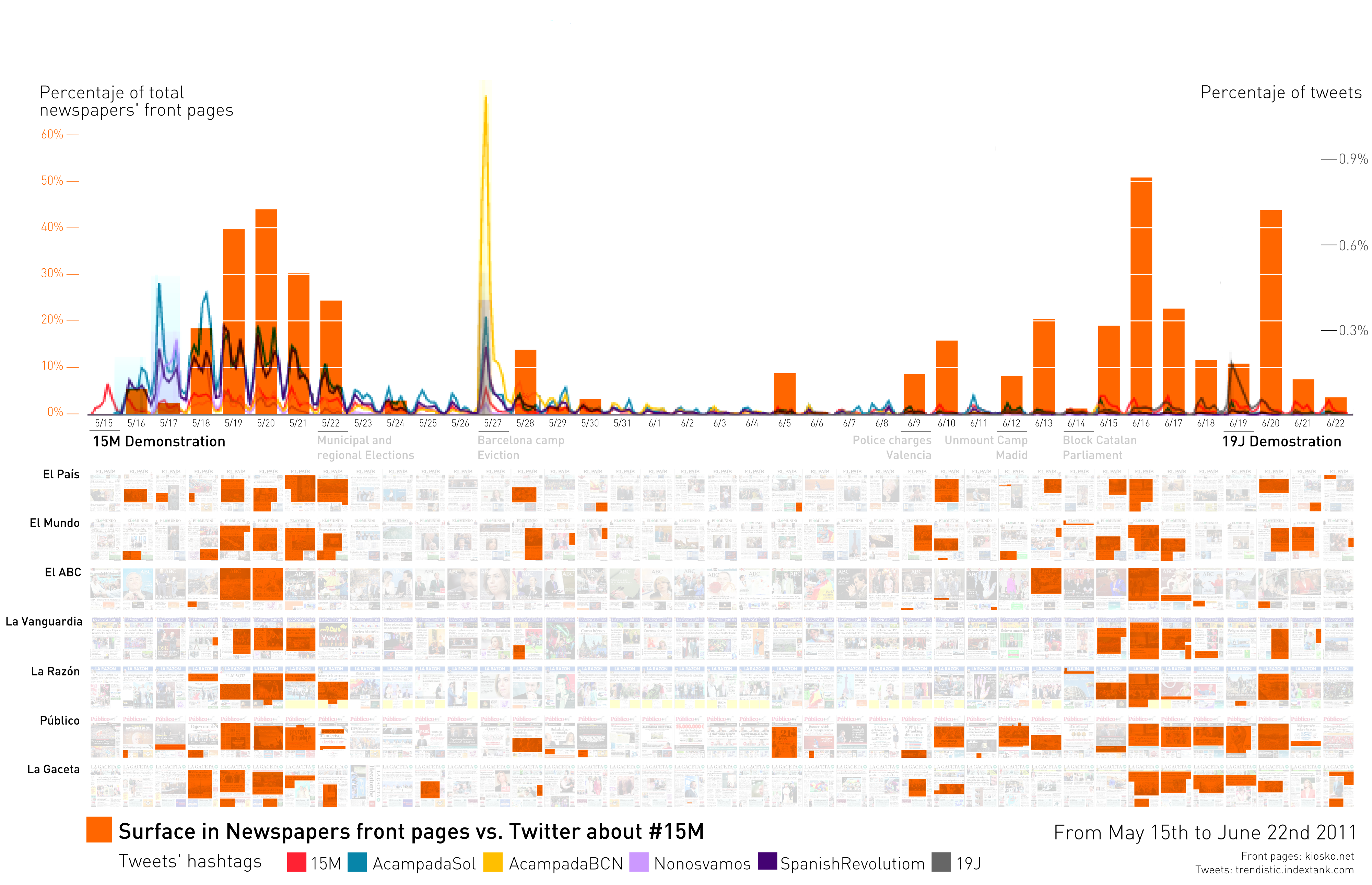
Tweets are instant messages that cover events almost in real time. On the contrary, front pages cover the news of yesterday. Therefore, it is normal to see how different media react to the same event: Twitter coverage peaks the day that it occurs, and press coverage peaks the day after. Following this idea, it is more interesting to explore when Twitter and the press differ: When enormous tweet traffic about an event or action is not followed by that big coverage, or when a week-long, sustained conversation in Twitter around a hashtag doesn’t find its way into the print.
3. The Front Page Data Visualization: Building a Tool
The first data visualization started as “manual” process: I downloaded the images one by one from kiosko.net, a website providing newspaper front pages from all around the world, and built the array of images with Inkscape, a vector graphics program. Later on, after the good acceptance of the visualization, I started building a script to allow others to replicate this kind of analysis. Around a year later I started PageOneX, a free software tool (code available in github), designed to aid the coding, analysis, and visualization of front page newspaper coverage of major stories and media events.
PageOneX constitutes a straightforward way of interpreting front pages, a very specific piece of the media ecosystem that has direct influence on radio and TV broadcasts. In the past, researchers trying to analyze front pages needed to obtain copies of newspapers, measure column-inches by hand (with a physical ruler), and manually input measurements into a spreadsheet or database. This laborious and time-consuming process would be followed by calculation, analysis, and sometimes data visualization. Some of these steps can now be automated, while others can be dramatically simplified.
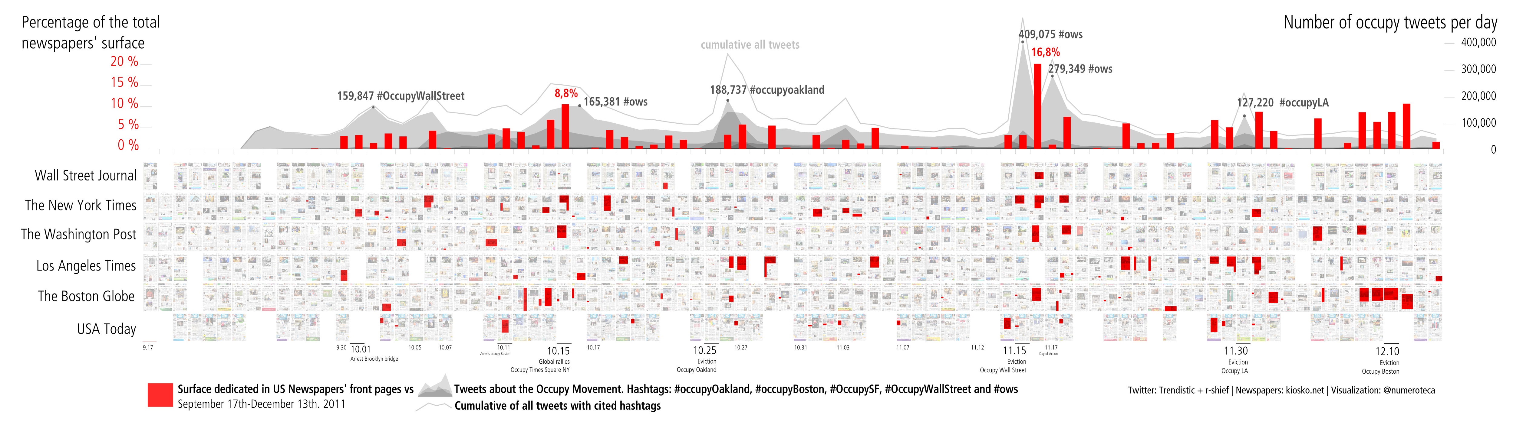
The process described here is designed to facilitate the relatively rapid creation of “small multiple” data visualizations of front page newspaper coverage. “Small multiple,” a term popularized by Edward Tufte, is a kind of data visualization that allows the visual comparison of multiple series of data: Series are displayed separately and placed next to each other. In the case of PageOneX, the displayed data include small images of the newspaper front pages themselves, as well as the surface area on the newspapers’ front pages dedicated to a specific news story (a “thread”) that runs chronologically along the x-axis (time). Coders manually select the portion of front pages dedicated to that thread. The selected areas are then displayed as shaded or colored transparencies on top of their original front pages. When viewed at sufficiently close range (zoomed in to a story), the text of the original stories that have been coded can still be easily read. However, this form of graphical information display is most compelling on a larger scale: Small thumbnails of the newspaper front pages are arrayed chronologically from left to right, and the viewer is then easily able to see at a glance the evolution of the coverage – or lack of coverage – of a particular news thread over time, as well as to compare different newspapers.
The visual approach allows the reader to have a sense of the coverage and, at the same time, have a look at the very raw data of the analysis, which are the components of the article, whether they be images, headlines or text. These highlighted areas could also be quantified to produce a bar chart. To make the measurements of the areas of news coverage comparable among different newspapers sizes, we use the percentage of used surface, and not the real area in mm².
The basic visualization of this type of graphic displays both the data itself (front pages and highlighted surfaces) as well as the measurement (the percentage of surface area) in a bar or line chart. Bar charts give a more accurate view of the surface devoted to the story, whereas line charts (see below) appear as a more continuous timeline, although they run the risk of suggesting a visual interpolation of discrete data. In other words, newspaper front pages provide one surface area datum per day, so a line connecting 2 surface area data points (from two consecutive days) produces a false sense of continuity. Line charts are useful, however, to compare more than 2 news threads over a long period of time, like the Arab Spring coverage (Egypt, Syria and Libya). When different topics are displayed one beside the other, it is a good way to study the battles for attention in the media; how related news “fight” for a position on page one, like in the Arab Spring coverage (Egypt, Syria, Libya and others) in Spanish newspapers.
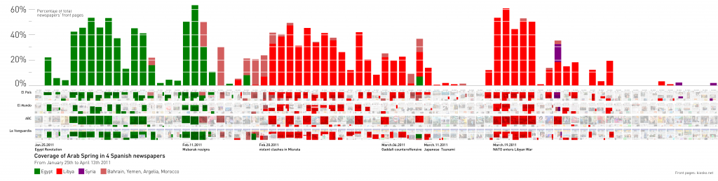
We can see how the media space is usually focused on one “revolution” at a time, and that there is not much juxtaposition of news about this topic.
We observed a big drop in the Arab Spring coverage on April 13th, because the Japanese tsunami was breaking news: Note how the green area (Japanese tsunami) “hides” all the other news related to the Arab Spring for a week. It is not the case that “nothing” related to the Arab Spring happened during that week, but rather that the media decided where to pay attention. News on front pages “fights” for space and its areas are related to one another.
Comparing Asynchronous News Coverage in Time
The relative measurement of the surfaces lets us not only compare different news from different newspaper sizes, but also from asynchronous timelines. This method would allow the measurement of the news cycle: enabling us to understand how long news lasts on the front pages and how similar events attract the attention of the media.
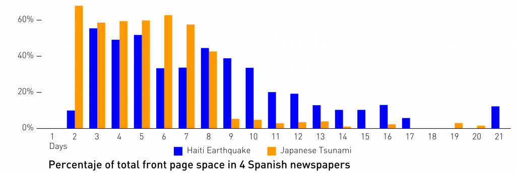
In the comparison of the surface coverage dedicated to the Haiti earthquake (day 1 = January 12th, 2010) and the Japanese tsunami (day 1 = March 11th, 2011) in 4 Spanish newspapers, we could measure and compare the length of the coverage. Remarkable is the rapid drop of the Japanese crisis coverage after day 8 (March 18th, 2011), caused by the UN’s authorization allowing the international community to enter the war in Libya.
Semantic Analysis of News Content
It is also possible to make an automatic estimation of the article’s content based on semantic technologies. This process would benefit from the automatic transcription of scanned newspaper front pages through optical character recognition (OCR). The graphic displays the number of times that certain words have appeared during the fall of Mubarak and Ali. Grouped under “democratic” and “dictatorial” groups, January and February 2011.
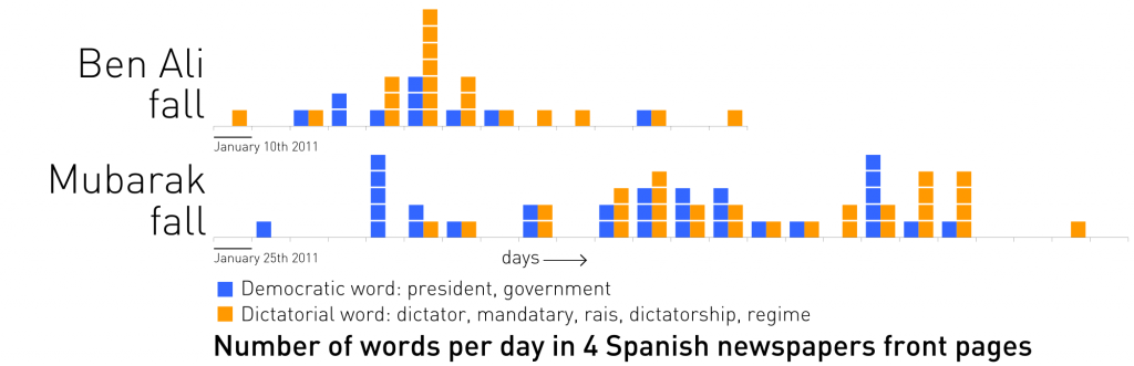
As a case study, we used the fall of Mubarak and Ben Ali to compare how newspapers framed their last government/regime days. We analyzed the number of times that certain words appeared on the front page, and grouped them into two pools:
- Democratic: president, government.
- Dictatorial: dictator, rais, dictatorship, regime.
The aim of this study was to measure how newspapers are shifting their vocabulary along time, depending on their support / alignment with the issue they are covering. In Mubarak’s fall, we can see how newspapers shifted their frame during the crisis from a predominant use of democratic words (president, government) to more dictatorial ones (dictatorship, dictator, regime). In the case of Ben Ali, more “dictatorial” types of words were employed to describe his last days in power.
Content and Frame Analysis
We have seen how articles can be categorized, then colored and quantified, by multiple taxonomies related to their content: a particular thread or categorized by country. To understand how newspapers are addressing one topic would be not enough to understand how much they are covering it. We will need a framing analysis of their coverage: Are they positive/neutral/negative about it? Are they supportive? How biased is the information they provide?
We used this approach to analyze how different Spanish newspapers were covering corruption cases. The fast-growing list of corruption investigations in Spain contained almost every institution in the country. Everyday, new information and a new cases were being unveiled, provoking an increasing sense of indignation. It was also true that the levels of indignation had reached an apex, that they caused either incredulity or insensitivity.
The hypothesis and common ground knowledge is that every Spanish newspaper is aligned with a political party. Newspapers follow the corruption cases of the “opponent” parties. Measuring front page coverage seemed to be a good proxy to analyze their political agendas and to verify the hypothesis. I selected the most important Spanish newspapers and highlighted the stories related to the different corruption cases during a one-month period.
In January 2013, the El Mundo and El País newspapers reported that the ex-treasurer of the ruling party (Partido Popular, PP), Luis Bárcenas, had a $29 million Swiss account, and then published excerpts from the party’s parallel financial account. Both scoops impelled all the other newspapers to talk about the same PP corruption case, although other corruption cases affecting the main parties were also on the media menu. We coded the corruption cases from the major three parties: PP (conservative), blue; PSOE (center-left social democratic), red; CiU (conservative Catalan nationalist), orange; the royal house, green; other cases, purple.
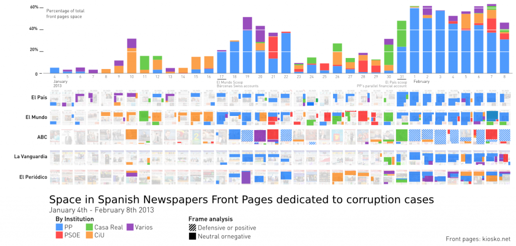
Both newspapers, El Mundo and El País, are in opposite political spectrums, but made a common effort in this case to cover the Bárcenas story affecting the conservative party (PP) in the government.
El País centered its coverage on the PP (blue), leaving little space to the CiU (orange) or the monarchy (green), and none to the PSOE (red), following the expected behavior of a party related to the PSOE and the center-left. Meanwhile, El Mundo had a colorful timeline illustrating all the major corruption cases. Since the newspaper tends to defend the PP and attack the PSOE, it represented a change in their agenda.
However, some things did not fit into the alignment of mass media with certain major political parties that we could have expected. All of the newspapers were talking about the PP corruption case, but not in the same way. To understand how they were framing the story, we needed to add a new layer to the visualization: The issue of whether newspapers were framing corruption neutrally or negatively (plain areas) or defending and giving a positive view (striped areas).
A conservative newspaper like ABC (2nd row) dedicated their entire front page to the PP corruption case, but after the first news proclaimed that “PP must tell the truth about the Bárcenas case,” they started defending the actions the PP was taking. As expected, other conservative newspapers (La Razón, La Gaceta, but not El Mundo, which had published the scoop) took a defensive position (Jan. 19-20). It is also worth noting that once El País released the excerpts of the parallel financial account (Jan. 31), La Gaceta, a far-right newspaper, stopped defending the PP.
I published a blog post about this case study that garnered a lot of attention in the social media sphere (Twitter). It is worth mentioning that El Mundo published a piece on this research: “El Mundo, the newspaper that covers all corruption cases” in a four-column headline[ref]“A study by the prestigious MIT in the US shows that this newspaper stands out in the Spanish press for investigating the political parties without exception”. . [/ref]. They were interested in showing how the data visualization supported their unbiased work, and redrew the graphic to show El Mundo in first place.
In Spain, mass media are usually blamed for maintaining and supporting the bi-partisan system[ref]PP-PSOE, both parties are the ones entangled in more corruption cases; check the Corruptódromo map.[/ref]. This time, however, some newspapers were playing a fundamental role in unveiling corruption cases, but most of them only kept reporting about certain corruption scandals. Only a well-informed citizen who escapes the biased point of view of his/her reference newspaper can get the full picture of what is happening and react accordingly.
4. Conclusion
The method for analyzing newspaper front pages that we have described here, as well as the PageOneX.com platform, provide a straightforward way to analyze and visualize news attention to specific stories over time, across or between newspapers. In the future, we imagine either extending this tool or connecting it to others focusing on other media platforms, such as TV[ref] Archive.org is making the TV searchable by recording TV images and captions in a public archive: http://archive.org/details/tv .[/ref] and radio broadcasts, or to the online versions of newspapers and social media.
Content analysis, and newspaper content analysis by amount of coverage, has had a long history in the field of communication studies. New tools are enabling novel approaches to this kind of analysis. Some aspects of newspaper content analysis can be automated, some can be distributed (crowdsourced), some can be done much more quickly by human coders using sophisticated new interfaces. The data produced by such analysis can also be visualized in new ways, and compared against data from other new sources of information flow such as social media. This essay has explained the approach we have taken with PageOneX, demonstrated its application to several specific stories, and suggested areas for further work. We hope that PageOneX provides a valuable example to anyone interested in monitoring the media: communication scholars, social movement activists, or advocacy organizations.
We invite anyone interested to contact us and to participate in the future development of the platform.
Pablo Rey Mazón 2013.
–
