View this datavis full size at gigapan and the related post about May 2012 social mobilizations in Spain.
Today’s post is to present the tool we are building this summer: PageOneX. The idea behind is to make online and easier the coding process of front page newspapers. Make this visualization process available for researchers, advocacy groups and anyone interested. I’ll will give some background about this process.
How things started
Approximately one year ago I started diving in the front page world. It was days after the occupations of squares in many cities from Spain, and I was living in Boston. I made a front page visualization to show what people was talking about: the blackout in the media about the indignados #15M movement. You can read more about Cthe story in the ivic Media blog. Since then I’ve been making more visualizations around front pages of paper newspapers, testing different methods and possible ways to use them. I’ve also made a tool, built in Processing, to scrap front pages from kiosko.net and build a .svg matrix.
- Gallery of different twitter-newspaper visualizations. https://numeroteca.org/cat/frontpage-newspaper/
- Post: Analyzing newspapers’ front pages to interpret the Mainstream Media ecology.
http://civic.mit.edu/blog/pablo/analyzing-newspapers-front-pages - Presentation: Approach to a User interface. http://www.slideshare.net/numeroteca/arab-spring-spanish-recolution-and-occupy-movement-mainstream-media-vs-social-media-coverage and more presentations at http://www.slideshare.net/numeroteca
- Code for the semi-automated process built in Processing: https://github.com/numeroteca/pageonex-processing
https://github.com/numeroteca/PageOneX
PageOneX: first tool
Before starting with the new tool, I’d like to present the present one I’ve been using this past moths: a semi-automated process with Processing and Inkscape. The code is available at https://github.com/numeroteca/pageonex-processing https://github.com/numeroteca/PageOneX.
The process is segmented in two main actions: 1. Get the front pages and 2. Code articles.
- Get the front pages
Open the pageonex.pde file and open it in Processing:- Select newspapers and starting and end dates (be aware of adjusting the size of the newspaper)
- Run the program to scrape front pages from kiosko.net. It automatically downloads them.
- It will construct the matrix of front pages in a .svg (Scalable Vector Graphics) file.
- Code articles
- Open the matrix.svg in Inkscape. It is a file with 3 layers:
- Highlights (multiply option to show transparency)
- Filter to make images look lighter.
- Images of front pages.
- Now highlight by hand the news we want by drawing rectangles (merging of rectangles for news with non-rectangular shapes) on the news.
- Export the file to a pretty .png file
- Open the matrix.svg in Inkscape. It is a file with 3 layers:
That was the process until now. It works, but it is not easy for not tech savy people: you need to have Processing installed, change the parameters and be able to ‘play’ with Inkscape at an intermediate level. That is how we decided to make this tool online, to broaden its use.
PageOneX.com
PageOneX.com (now temporary redirected to this blog) is an online platform for analyzing and visualizing coverage of news in newspapers’ front pages. We’ll be coding this summer to have at least a part of the tool available by August-September. We’ll be having some beta tests, so if you are interested, just ask for it! The idea is to open a co-design process where future users take part in the design of the tool.
Why analyzing front pages? Some ideas behind the project:
It seems that analyzing front pages is a good method, a shortcut to follow how news are being covered in the media. Front pages are a very special piece of the media ecology: newsrooms spend a lot of time deciding what goes in their A1, fighting which news have to be in their page one.
With this kind of visualizations we are able to show the data and the analysis at the same time. We can show in a bar chart quantitative data regarding the coverage, but also the data source it self: the front pages. We want to offer a visual and direct way to visualize all the coding. Check the The Global Media Monitoring Project Report methodology to see which other interesting approaches to this coding process. We have tested with Gigapan the possibility of exploring this huge graphics, to be able to read the newspapers and also have a sense of the whole data visualization.
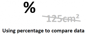
We’ll be using the percentage of every front page, instead of the actual size: it will allow us to compare newspapers with diferent sizes as we did with this example of US and Spanish newspapers covering the Japanese Tsunami in 2011.
Here there are slides about the project and basic draft for the User Interface.
Arab Spring, Spanish Revolution, and Occupy Movement: Mainstream Media vs Social Media coverage
The project is incorporating new collaborators: Ahmd Refat as coder, thanks to the Google Summer of Code programm; Sasha Costanza-Chock and Nathan Mathias from the Center for Civic Media at MIT Media Lab. Nathan is developing is also developing Mediameter with more people at the Center for Civic Media, we might be using their framework to build our tool and not start from scratch. Mediameter is used for crowd-source analysis of articles. We are also looking at Mapmill by Jeff Warren, built in Ruby on Rails, as it is a system to code image as well.
Stay tuned!


