Who wrote the news? Gender in the front page

margin_between_images-2

The best way to show the last improvements in PageOneX‘s development is by using them. After lasts Ed’s commits it is possible to draw as many rectangles as you need when coding a single front page, whereas before it was only possible to draw 2 rectangles per image.

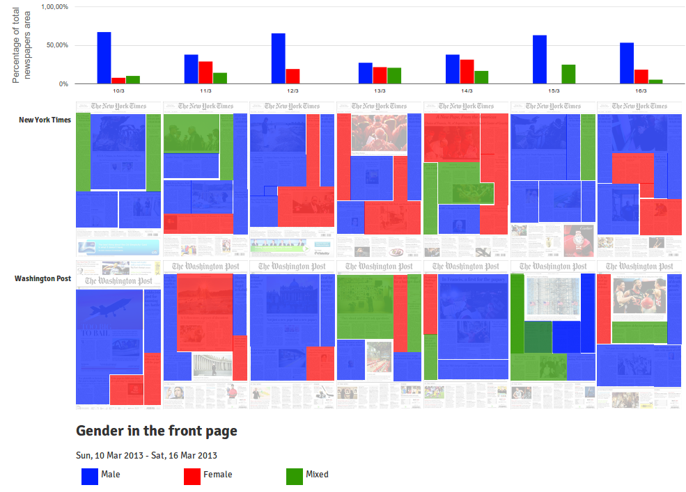
I used this new feature to analyze the gender of the bylines: who is writing the news that are in the front page. It is inspired in the research that Nathan Mathias is developing about gender and the news. In his case, he’s written a script to analyze the byline automatically from online newspapers. Check Nathan’s posts about this topic: Gender in Global Voices, Women’s Representation in Online News, Data science for gender equality: Monitoring womens voices in the news and Women, news, and the internet: (almost) everything we know.

What is presented above is a visualization of the same kind of study, in this case, a infinitesimal portion (last week in two newspapers), and manually coded with the help of PageOneX. I only coded the articles that had the byline visible in the front page. The images that were not related to an article were left un-coded.

It would be interesting to compare the data obtained with this method with the ones obtained by a study by Women in Journalism “Seen but not heard: how women make front page news” (WiJ) that “found that 78% of all front page bylines were male; 22% were female”. Their research studied  UK newspapers and their method was slightly different:  they “counted the number of female and male bylines on each front page”, whereas PageOneX calculates the percentage of surface of the articles. Nevertheless, it might be interesting to compare results with a larger data set. WiJ’s study was a 4 weeks period and also analyzed the content of lead stories and photographs. It is worth checking the graphics based on these data by the Datablog  (all the data are available) and the article by Jane Martinson.

I am particularly interested in how a tool like PageOneX might be able to make the coding process of news and its data visualizations faster, easier and more visually compelling. The coding process presented in this blog post took me less than one hour.

If you are interested in collaborating or using PageOneX you can join the developers’ listserv, the users’ email list or the newsletter.

PS: This new feature is not yet in the available in the alpha online version, but it soon will. Meanwhile you can download and install your own deployment. Continue reading →
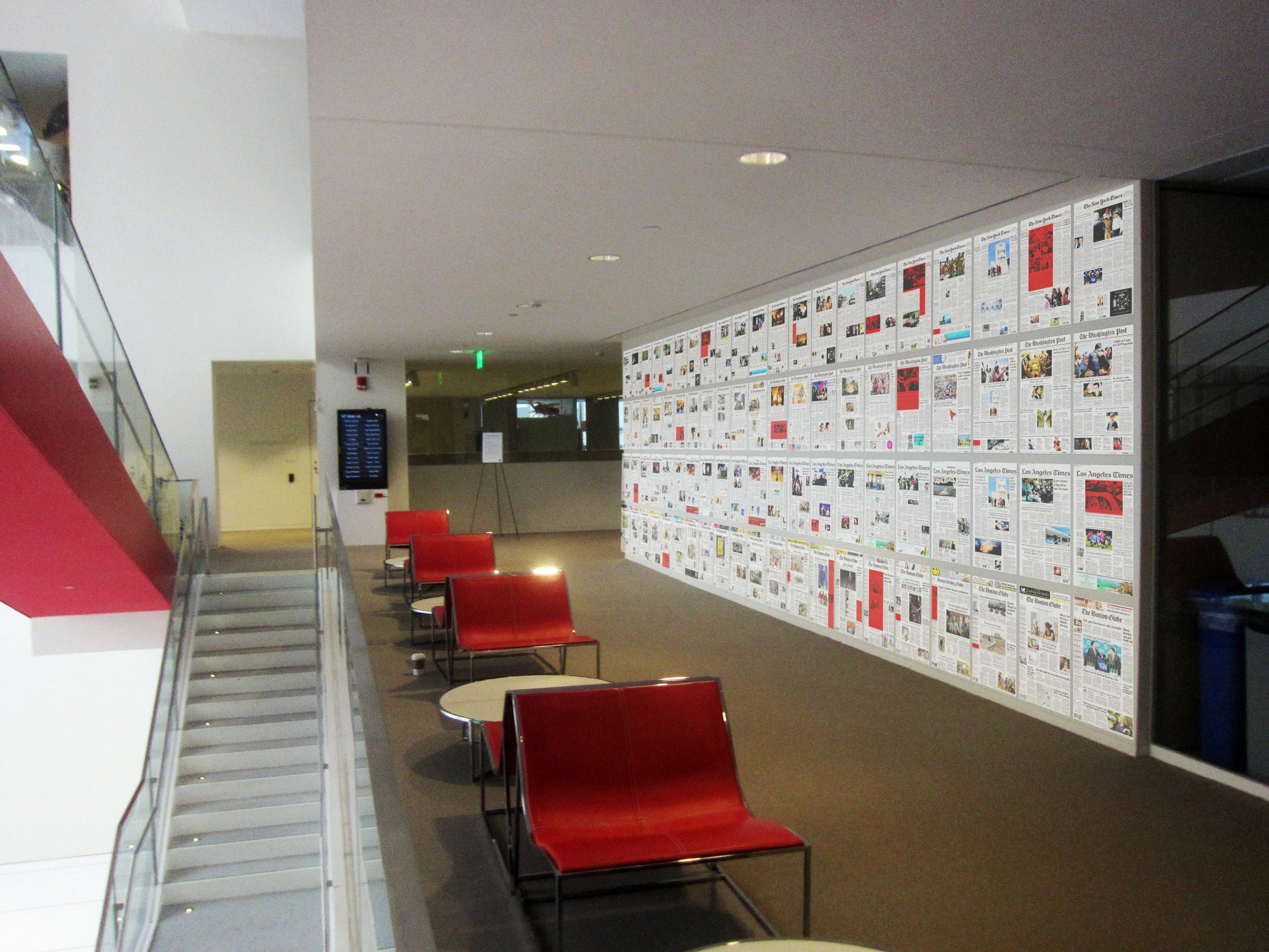
Newspaper coverage goes 1:1 scale

PageOneX: How newspapers tell the story proposal for the Media Lab Festival
PageOneX: How newspapers tell the story? This is how the project would look like at the MIT Media Lab Festival

[Update: there is a post with all the photos related to the installation Guns, Wars and Terrorism in a PageOneX real size (photo essay)]

PageOneX keeps moving forward. We want to have it ready for the spring, but first we have to solve a large list of bugs and other issues. A lot to code! So much coding that we sometimes forget that paper newspapers are real objects. That’s why we want to make a physical visualization of newspapers, a 1:1 scale version of PageOneX for the MIT Media Lab Festival (April 2013).

We have yet to decide the topic/s we want to focus on and when we are going to start buying newspapers. Our original plan is having New York Times, Los Angeles Times, Washington Post and The Boston Globe.

Do you have any suggestion about which topic we should follow? When to start buying the newspapers?

We are inspired by other people that have done similar displays with real newspapers that we have came across recently:

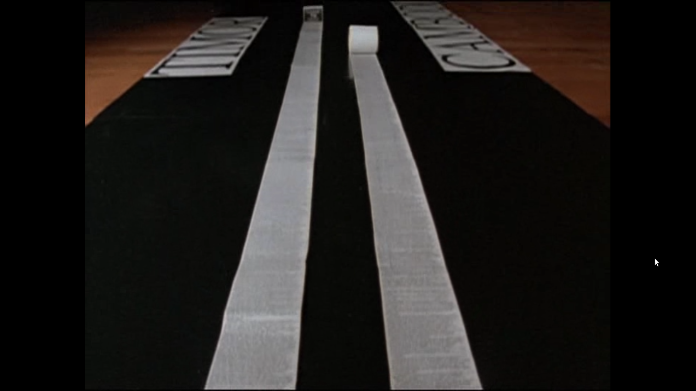
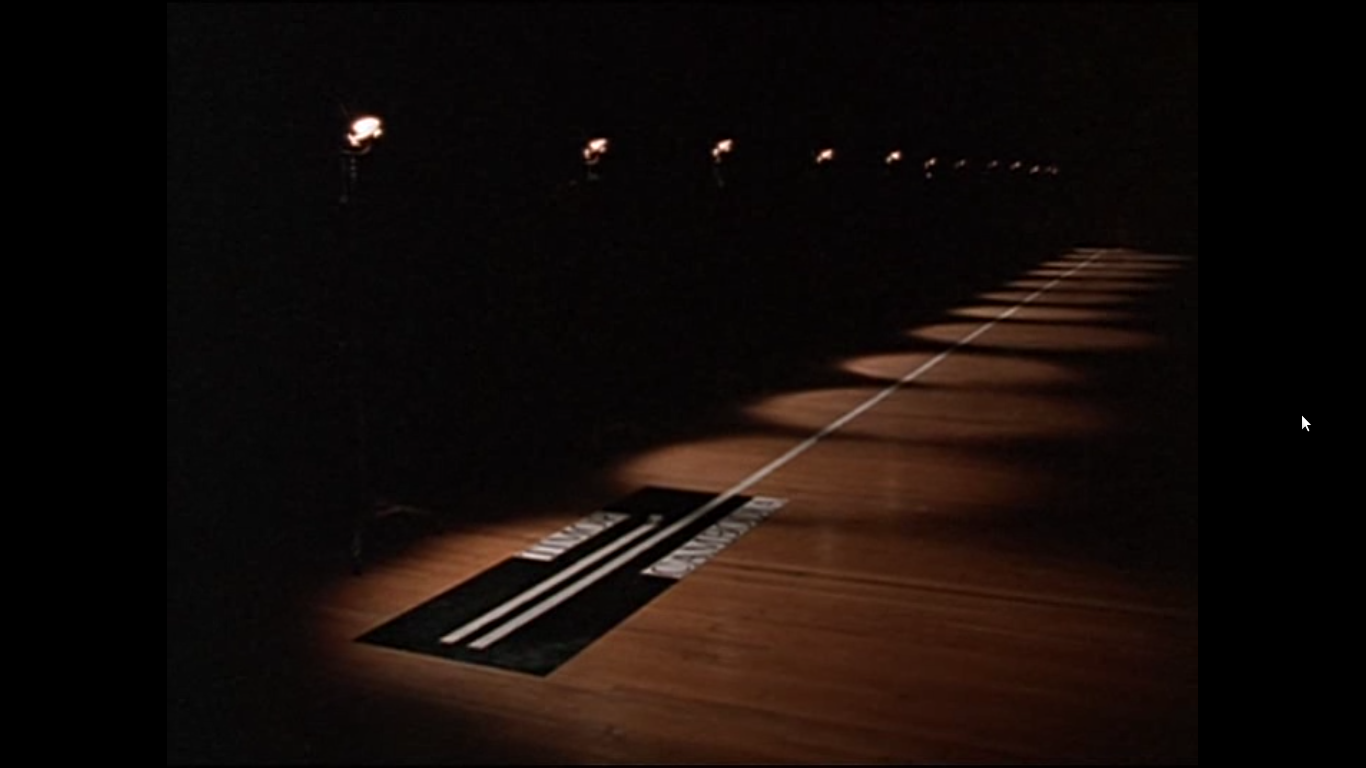
The film Manufacturing Consent: Noam Chomsky and the Media (1992) (available to watch in archive.org) by Mark Achbar and Peter Wintonick makes visual what the book Manufacturing Consent by Chomsky and Herman describes. They use as a case study the coverage of Timor war and Cambodia wars, that were happening simultaneously (1975-1979) by stitching together all the columns of text that The New York Times dedicated to each topic. Column inches is the measure that academics (and advertisers) have used to measure the amount of coverage. It was a way to show the different amount of coverage that state atrocities get, depending if they came from friend or allies states or from official enemies of the US. It is an empirical demonstration of the propaganda model.

Genocides coverage in column inches in The New York Times:

East Timor vs Cambodia news  from film Manufacturing Consent: Noam Chomsky and the Media East Timor vs Cambodia news  from film Manufacturing Consent: Noam Chomsky and the Media East Timor vs Cambodia news  from film Manufacturing Consent: Noam Chomsky and the Media

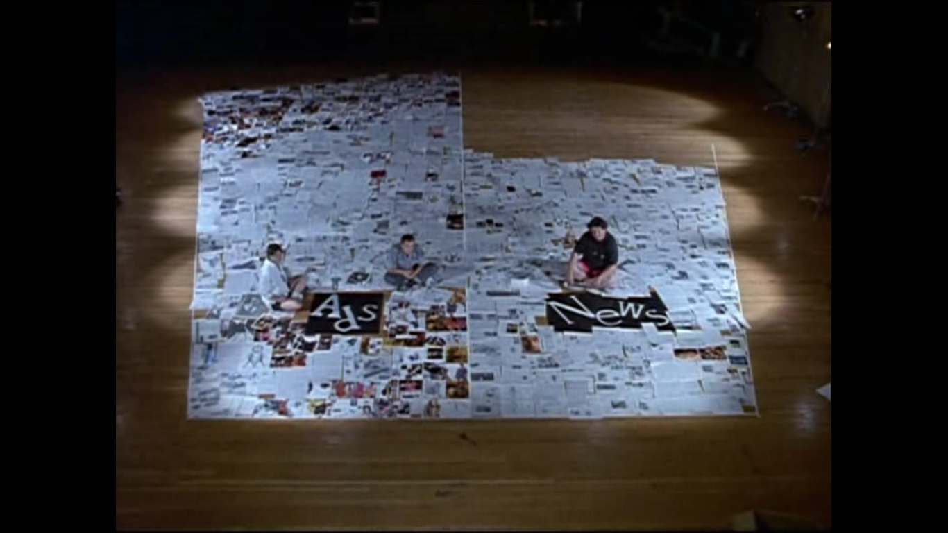
They also make a wonderful display of surface area dedicated to see the ratio of advertisement and news in a  The New York Times newspaper (we are thinking on replicating this data visualization):

Ads vs news in New York Times from film Manufacturing Consent: Noam Chomsky and the Media

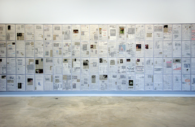
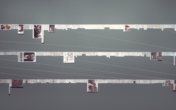
Inspired by the Manufacturing Consent film Siemon Allen made his Newspaper project. He was struck by the fact that during the same period 1975-1979 in South Africa another important event was happening “the Soweto uprisings, heightened police oppression, the expansion of separate development, and the death of many activists, including Steve Biko”. He made similar visual displays to show how was the coverage about South Africa in US newspapers:

Showing certain news in newspapers or cutting and pasting the news in long strips.

Siemon Allen Newspaper project. Hightlighing certain news
Siemon Allen Newspaper project. Cutting the news and forming strips.

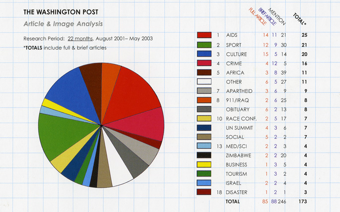
He also made standard data visualization (pie charts) when he analyzed the content of the news and classified it: aids, sport, culture, crime…

Siemon Allen Newspaper project. Percentage of coverage to certain categories in The Wahington Post.
Siemon Allen Newspaper project. Percentage of coverage to certain categories in The Washington Post.

Note: The photos from the film are screenshots I took. The Siemon Allen images are all extracted from his website.


Cómo aumentar el tamaño máximo de subida de archivos en wordpress en gandi.net

Desde hace un tiempo en motnera34 estamos mudando todas nuestras páginas a un hosting en gandi.net. Después de superar los problemas de bases de datos de wordpress de más de 10Mb con BigDump, parece que todo estaba solucionado. Lo que pasa es que nos habíamos olvidado del tamaño máximo de subida de archivos desde el propio escritorio de wordpress, por defecto es 2Mb. Para aumentarlo, al menos en gandi.net, basta con incluir ahcer una pequeña modificación en el .htaccess. El .htaccess está en el directorio raiz de tu servidor, cuando lo descargues es probable que no puedas verlo, tendrás que dar en tu navegador de archivos a “ver archivos ocultos”, que son todos aquellos que tienen un punto delante.

Edita el .htaccess y añade estas líneas:
php_value upload_max_filesize 64M
php_value post_max_size 64M
php_value max_execution_time 300
php_value max_input_time 300

Vuelve a subirlo donde lo habías encontrado, en el raiz de tu servidor.

Encontré la solución tras probar las diferentes opciones que contaban en wpbeginner.


Nemo snow storm photos

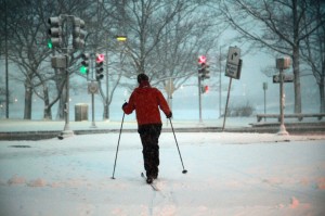
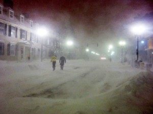
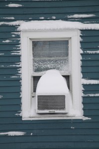
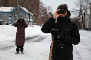
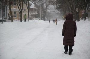
It took two weeks to publish them, but after another snowy weekend, I had to publish the photos of the quiet city after the storm (no cars, just people shoveling and walking on the streets).

3 steps to measure the corruption coverage in Spain

The fast-growing list of corruption investigations in Spain have involved almost every institution in the country: the major political parties, the royal house, the supreme court or the national bank, just to mention some of them. Everyday, new information and a new case is released/unveiled, provoking an increasing sense of indignation. It is also true that the levels of indignation have reached an apex, that they cause either incredulity or insensitivity.

I decided to test PageOneX, a tool to visualize the evolution of stories on newspaper front pages, to see how the coverage on corruption was being made. It is a good moment to do so, now that we, at the Center for Civic Media, are currently developing it. We hope to have a fully functional version by the end of the month, but you can always test the online alpha version or install the code locally. You can also get involved in the testing and development, it is open source.

This post is based on another I wrote in Spanish Es lo mismo pero no es igual in my blog.

1. Corruption or not corruption?

The hypothesis and common ground knowledge is that every Spanish newspaper is usually  aligned with a political party. They usually  follow the corruption cases of the ‘opponent’ parties. Measuring the coverage in the front page seemed a good proxy to analyze their political agendas and to verify the hypothesis.

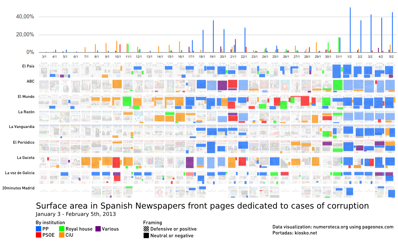
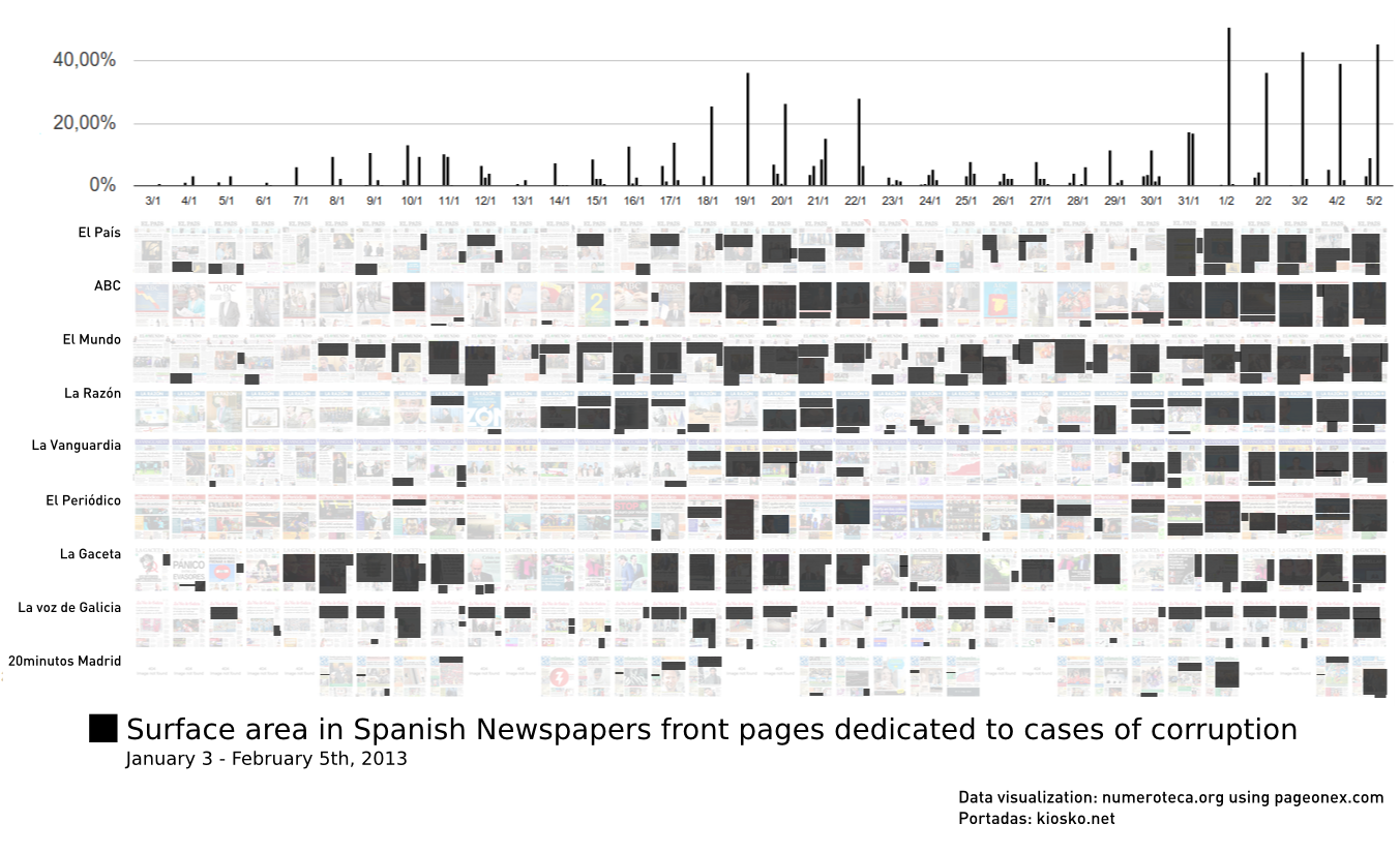
I selected 9 Spanish newspapers and highlighted the stories related to corruption cases in the last days until February 5th, 2013.

130205_corruption-spain-pageonex

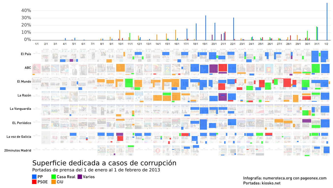
There are two big ‘black’ clusters: after Jan. 17th, when El Mundo published that the ruling party ex-treasurer, Bárcenas, had a $29 million swiss account, and after January 31st, when the excerpts from the party’s parallel financial accounts were published by El País. Both scoops drain all the other newspapers to talk about the same PP corruption case.
Continue reading →
Es lo mismo pero no es igual

[Actualización del 4 febrero 2013: puedes ver más abajo la versión actualizada.]

Ayer publiqué la cobertura en la prensa española de casos de corrupción, pero hacía falta un análisis cualitativo para entender en qué tono estaban escritas las portadas. Creo que llevaba a error pensar que cuando todos los periódicos hablaban de lo mismo decían lo mismo: unos defienden y los otros atacan o simplemente informan. Algo parecido hice sobre las movilizaciones sociales del mayo pasado cuando clasifiqué según las noticias eran informativas o editoriales en primera página sobre el 15M.

leyenda-cualitativo

Esta vez he hecho una nueva taxonomía: artículo que defienden o valoran positivamente la actuación de un partido político y los que dan la información de manera más neutra o negativa. El umbral entre uno y otro es subjetivo, así que el criterio ha sido incluir solamente los casos en los que veía claro que eran una defensa o valoración positiva de una determinada noticia.

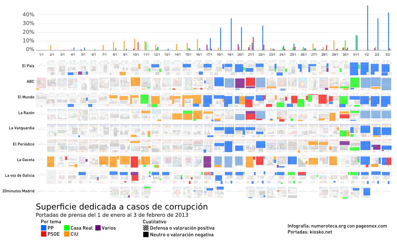
130203_enero2013-corrupcion-cualitativo-pageonex

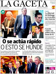
Se puede apreciar cómo la valoración positiva o defensa (área rayada en diagonal) es, básicamente, de los periódicos más conservadores (ABC, La Razón y La Gaceta) que defienden la actuación del PP. Hay varios métodos: dar razones para situar a Bárcenas fuera del PP o  apoyar los proyectos pro-transparencia de Mariano Rajoy y otros miembros del partido.

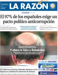
ABC, La Razón y La Gaceta coinciden también en dedicar al menos una portada a la ‘corrupción’ en genérico (área morada en el gráfico) en los cinco días posteriores del 17 de enero, que es cuando El Mundo publicó la noticia de los 22 millones de Bárcenas en Suiza. Es la táctica del “y el resto también”. El caso Bárcenas es demasiado grande como para ignorarlo, así que deben emplear otras tácticas diferentes de la del “avestruz” o el “y tú más”.

Continue reading →
Cobertura en la prensa española de casos de corrupción

16:02h. 3 febrero 20013. Hay una actualización de este gráfico en Es lo mismo pero no es igual.
2013enero-corrupcion-pageonex-c

El mes de enero ha estado cargado de noticias de diferentes casos de corrupción que han afectado a los principales partidos políticos y a la casa real: Nóos, Pallerols, Baltar, Amy-Mulas, Gürtel, Pokemon, Lloret de Mar, Bárcenas… Es una oportunidad idónea para comprobar de una forma visual cómo cada periódico se alinea con un determinado partido o en contra de otro.

El mes tiene un marcado color azul (PP) por la cobertura de todos los medios del caso Bárcenas, pero también hay naranja (CiU) que con Pallerols y Lloret hacen doblete, rojo (PSOE) con el caso Amy-Mulas y el verde (Casa real) de Urdangarín y su Instituto Nóos. La cobertura es bastante desigual salvo cuando todo el coro canta al unísono en los estribillos del caso Bárcenas.

El método utilizado analiza las portadas de prensa y mide el porcentaje del total que dedican a una determinada noticia. De cada portada se han seleccionado las dos noticias relacionadas con las corrupción más importantes.

elpais-pageonex

El País tiene una trayectoria constante: azul PP con algunos pequeños toques verdes Urdangarín y Revenga. Se mantiene constante su cobertura (10-20%)y, cuando llega su scoop, da toda su portada a los papeles de Bárcenas subrayados. El rojo PSOE no aparece por ningún lado, y los tejemanejes de Nóos y Urdangarín están pero en tamaño pequeño.

abc-pageonex

ABC, por las características de su portada con una imagen que lo ocupa casi todo, tiene siempre mayores porcentajes, superando a menudo el 50% de cobertura, hable del tema que hable, Es binario, o blanco o negro. Después de la aparición de la cuenta en Suiza de Bárcenas (17 de enero por El Mundo) le dedica dos portadas seguidas al tema, para luego hacer una, el día 20 de enero (morado), con un fotomontaje de corruptos de toda condición. Al siguiente, para compensar, saca a Griñán y sus EREs. Cabe señalar que cubrir una noticia de corrupción no significa que se esté criticando al partido en cuestión: el 22 de enero titula “Luz y taquígrafos” para anunciar que Rajoy realizará una auditoria externa e interna para “zanjar especulaciones”. Cerca del final dedica toda la portada a la fianza para los de Nóos, y cierra, como todos, con Bárcenas y sus papeles.

elmundo-pageonex

El Mundo es el más multicolor: le da a todo. Desde después de reyes no hay día que no hable de algún caso de corrupción. Al principo con naranja CiU, luego llega el periodo azul con la cuenta de Bárcenas en Suiza, toques de rojo con Amy-Mulas del PSOE combinados con verdes Nóos al final. Al final vuelve a los papeles de Bárcenas empujado por la exclusiva de El País.

Nota: se ha dejado fuera del estudio el caso de la caja NovaGalicia y el conflico del Banco de España.
La visualización se ha realizado con la herramienta PageOneX, actualmente en estado de desarollo.