
Guns, Wars and Terrorism in a PageOneX real size (photo essay)
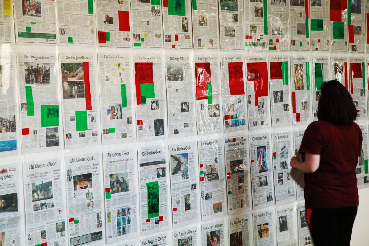 I finally installed the PageOneX real size project with stories related to guns, wars and terrorism. Come visit the display this week to the second floor of building E14 at MIT Media Lab. Thanks all of you that helped in this process: Adrienne, Luis, Álvaro, Nacho and Matjaz! What follows is a photographic guide to the PageOneX real size installation. Continue reading

Breath in, breath out.
A quick test with Local / National / by Continent news
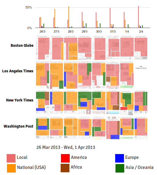
After yesterday’s Guns vs Sports vs Wars I wanted to test news by location: local, for news related to the city or region where the newspaper is published; national for US news; and continent (as Ethan suggested). This visualizations fits pretty well with the previous one, as it fills the gaps of the more locally oriented newspapers like The Boston Globe and LA Times.
I do not think I will use this approach in the final PageOneX real size version, but it is interesting to view the same newspapers coded by different ways. I can imagine a par of special glasses that would allow the viewer shift from one visualization to another.
Note: I have only coded the main news (the ones with bigger size).
I would have never thought it was so difficult to get the paper

It was one of those ideas that seemed easy: to build a real size 1:1 scale of a PageOneX analysis. I just needed to buy 4 newspapers during 4 weeks, highlight certain stories, and put them on the wall. However, as it usually happens, things are easier said that done.
Finding the newspapers

I thought that buying the newspapers everyday would be the easy part, a question of self-discipline, but things are not what they seem. My first idea was to get them from the public libraries, but at the Cambridge Public Library they told me that they are forced to destroy them after 4 months. The next approach was to go buy them.
It’s easy to find The New York Times at any corner. It costs $2.5 on week days and $6 on Sundays. It’s also easy to buy The Boston Globe, if you live in Boston. In my case, I am getting the Globe directly from them, as they have an open collaboration with the Center for Civic Media, where I am now based.
It got more complicated when I went to buy Los Angeles Times and the The Washington Post. It is not possible to buy them in Boston. I went to the bigger news stands and called the newspapers directly: they are not sold in the region, and I guess it would happen the same in other regions of the US. You can get Le Figaro or Le Monde with some days of delay, but not LA Times or Washington Post in the classical “Out of Town News” in Harvard Square. Anyone needing proofs that print press are having a bad time? So, my next step was to subscribe to those newspapers.
After a few phone calls I was able to subscribe to The Washington Post that Saturday for 4 weeks for $72, initially I had to buy at least 8 weeks. To get copies of the previous days I would have to pay the standard fee $10/copy. I also tried to get an online access as a subscriber, but it was not possible with my post subscription. They told me that I would receive the Washington Post told with a 2-4 days latency.
Los Angeles Times offices were not opened on weekends, so I had to wait until Monday to get the 8 week subscription, the minimum required, for $167. Luckily, I was able to get the papers from the days previous to my subscription. I would receive the papers with a 7-8 days latency, as they send them through regular post.
Newspapers at home

I hadn’t had the newspaper at home everyday since I was living with my parents. Finally directly in touch with the objects I’ve been studying all these past months: paper front pages. I could physically experience the overload of information and advertisement, piles of papers piling up on top of my closet. I could also see the above and below the fold news and experience the difficulties of the paper navigation. I find it really difficult to read these huge newspapers that are split into different booklets that fall apart when you open them. I also found the full page ads in the last page, which would be a great second phase of this project, a LastPageX visualization.
By now I have all NYtimes and Boston Globes since day one (March 26th). I am missing LA Times papers since April 9th (congruent with a 7 day latency), and from The Washington Post I miss the period March 26-29, April 8th, and since April 12th.
I have to start the installation this Wednesday April 17th. Therefore, for the newspapers that would have not arrived by then, I will have to use printed copies of the front pages, or maybe display a 404 error white page?
It’s being a good experiment on how difficult it is to get the paper copies of these newspapers. I can test now what I had written in the PageOneX description hundreds of times: that digital coding would avoid the problems of buying and storing newspapers.
One night the guy from the convenience store told me, when I tried to buy the NYTimes in his shop: we don’t sell newspapers, why would we when you can read them online?![]()
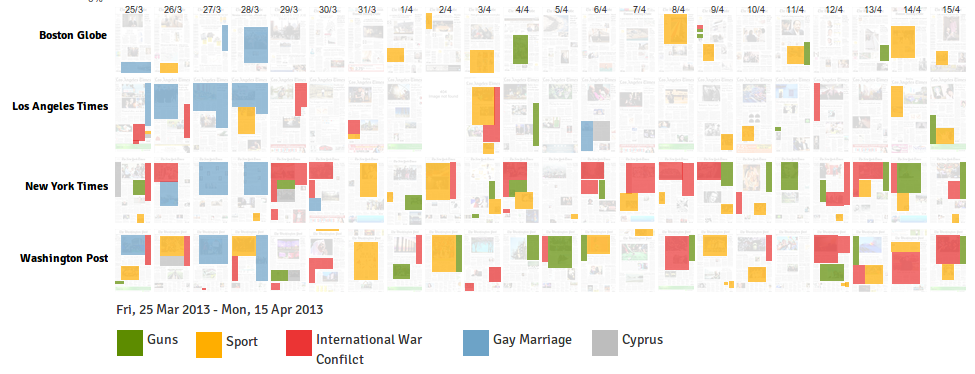
What to code? Guns, Sports and Wars
After an initial test I’m exploring the possibility of coding: Gun control vs Sports vs International War Conflicts. Here is how it would look like:
![]()
I also coded Gay Marriage and Cyprus economic Crisis news, but I think there was not enough and continued coverage to include them in the graphic.
- International War conflicts: Syrian, North Korea, Afgahinstan, Iran and Isael-Palestina.
- Guns: the debate on gun control and killing by guns in the US.
- Sports: basketball, baseball, golf, wrestling, marathon.
I am still open to suggestions! Bear in mind that what ever topics I select, I’ll have to manually cut the transparent pieces of colored plastic to put on top of the newspapers.
Want to join the coding process?
I will be reading papers + cutting plastic sheets from this Wednesday until Friday. Contact me if you want to join. It’s going to be fun to have access to all these newspapers. I am envisioning more projects beyond this one!
–
PS: when I was about to close this post, the Boston Marathon explosions occurred. How will it influence press coverage these following days?
Cross-posted at civic.mit.edu
Sueño de color
Fuimos a visitarle a su casa, resulta que vive por aquí cerca, en Boston. Tenemos una amiga común, pero no recuerdo su nombre. Una mujer mayor de pelo cano que vive en una casa con nombre propio ¿que había diseñado él mismo?
Es el Picasso mayor, calvo, pero muy animado y activo. Es sorprendente haber ido a su casa a cenar. Le pregunto por cómo se siente con tanta retrospectiva ¿o es la pregunta que imagino haber preguntado?
Me habla de uno de sus últimos proyectos. En una de esas estaciones de tren en mitad de la nada él va con un traje de chaqueta. La cosa es que ese traje desprende pintura de colores, y según se va apoyando en el edificio, lo va pintando. Una especie de gamberrada o arte público que va llenando de color la pared y a él mismo. Recuerdo los rojos en la pared y sobre su corbata, camisa y chaqueta. Algún azul tal vez, negros cerca del suelo. La pared cada vez más coloreada mientras él sigue girando y girando para pintar la estación entera.
Una especie de arte furtivo, pero no tiene quien lo persiga.
April full of trash activities
Basura = trash.
ama = love.
-orama = wide view of.
Basurama = wide view of + love trash
I’ll be giving a talk tomorrow Wednesday April 3rd about Basurama. I am presenting the multidisciplinary activities we develop around/with trash and the paper Basurama: a framework for designing collectively with waste (just presented to the Reclaim + Remake Symposium next week in Washington DC).
It will be at the Mahindra Center for the Humanities/Barker Center invited Cultural Agents Initiative and Harvard Humanitarian Initiative.
What: Talk: Basurama: a framework for designing collectively with waste
When: Wednesday, April 3, 2013 – 6pm – 8pm
Where: Barker Center, Seminar Room 133, Harvard University. 12 Quincy Street, Cambridge, MA.
Besides, for the end of the month, April 20th, I am preparing a waste installation How to picture 2 tons of waste? for April 20th. It’s going to be fun and… I need your help!
Who wrote the news? Gender in the front page
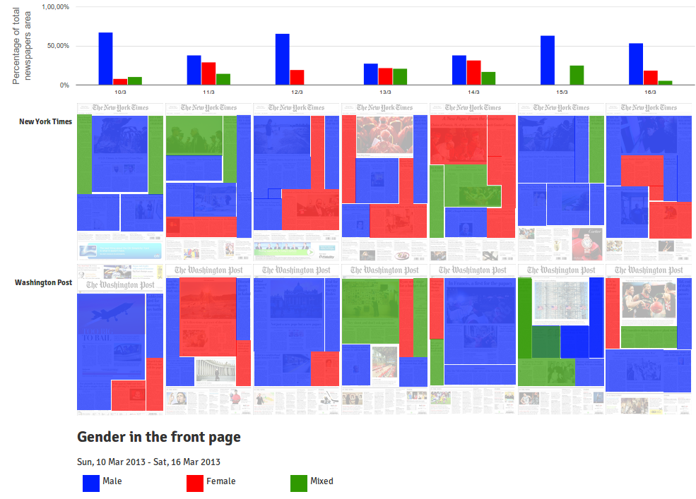
The best way to show the last improvements in PageOneX‘s development is by using them. After lasts Ed’s commits it is possible to draw as many rectangles as you need when coding a single front page, whereas before it was only possible to draw 2 rectangles per image.
I used this new feature to analyze the gender of the bylines: who is writing the news that are in the front page. It is inspired in the research that Nathan Mathias is developing about gender and the news. In his case, he’s written a script to analyze the byline automatically from online newspapers. Check Nathan’s posts about this topic: Gender in Global Voices, Women’s Representation in Online News, Data science for gender equality: Monitoring womens voices in the news and Women, news, and the internet: (almost) everything we know.
What is presented above is a visualization of the same kind of study, in this case, a infinitesimal portion (last week in two newspapers), and manually coded with the help of PageOneX. I only coded the articles that had the byline visible in the front page. The images that were not related to an article were left un-coded.
It would be interesting to compare the data obtained with this method with the ones obtained by a study by Women in Journalism “Seen but not heard: how women make front page news” (WiJ) that “found that 78% of all front page bylines were male; 22% were female”. Their research studied UK newspapers and their method was slightly different: they “counted the number of female and male bylines on each front page”, whereas PageOneX calculates the percentage of surface of the articles. Nevertheless, it might be interesting to compare results with a larger data set. WiJ’s study was a 4 weeks period and also analyzed the content of lead stories and photographs. It is worth checking the graphics based on these data by the Datablog (all the data are available) and the article by Jane Martinson.
I am particularly interested in how a tool like PageOneX might be able to make the coding process of news and its data visualizations faster, easier and more visually compelling. The coding process presented in this blog post took me less than one hour.
If you are interested in collaborating or using PageOneX you can join the developers’ listserv, the users’ email list or the newsletter.
PS: This new feature is not yet in the available in the alpha online version, but it soon will. Meanwhile you can download and install your own deployment. Continue reading