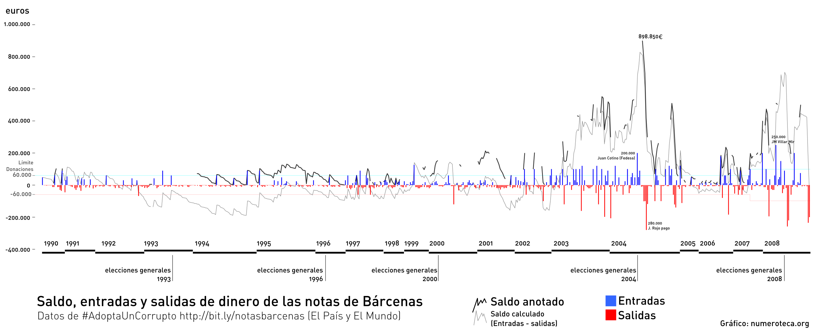
Actualización 11.42: el límite de donaciones pasó de 60.000 a 100.000 en mayo de 2007.
Día entretenido intentando entender las cuentas de Bárcenas. Este es un primer boceto basado en la hoja de cálculo que colaborativamente se ha rellenado en http://bit.ly/notasbarcenas con la iniciativa #AdoptaUnCorrupto
Este es un primer boceto en el que se pueden ver las entradas de dinero (azul), las salidas (rojo) y el saldo en caja (línea negra). En negro se muestra el saldo según quedó anotado y en gris el saldo calculado según las entradas y salidas. El desfase puede ser debido a que faltan algunos datos. Sería raro que una caja B estuviera en números negativos.
Mañana más. Queda toda la labor de ver a donantes y receptores. Crucé los datos con las fechas de las elecciones, a ver si se veía alguna relación.
¿Es la diferencia entre el saldo anotado y el saldo calculado las donaciones que no quedaron reflejadas en la contabilidad?
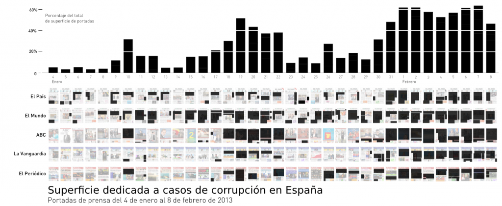
Las portadas de la prensa de papel son el lugar donde los periódicos condensan la información más importante del día. El uso cada vez más extendido de internet, ya sea en medios de comunicación clásicos (periódicos) o mediante redes sociales en internet (Twitter y Facebook) podría llevar a pensar que han perdido notoriedad, pero las portadas siguen siendo un elemento muy importante dentro del ecosistema de medios a la hora de definir la agenda mediática. Las portadas del día siguiente están presentes en los informativos de noticias nocturnos de televisión y radio y en las conversaciones de Twitter de madrugada. Las portadas de los principales periódicos marcan de este modo las agenda de lo que será “importante” al día siguiente en otros medios, como radios y periódicos más pequeños, y programas de televisión. La selección de noticias y su enfoque en la portada configuran su línea editorial, más casi que su línea editorial oficial. De un tiempo a esta parte han vuelto a ganar importancia y ha habido incluso “secuestros de portada” para no dar pistas a los competidores de las noticias que se van a publicar.
A finales de enero necesitaba un caso de estudio para poner a prueba el software y herramienta de estudio PageOneX. Ese mismo mes El Mundo y El País habían publicado sendos scoops sobre el caso Bárcenas, lo que arrastró a todos los periódicos a tratar un caso de corrupción que afectaba al Partido Popular (PP). Estas noticias podrían haber sido las causantes del aumento de la percepción pública de la corrupción como problema generalizado, y los periódicos, facilitadores a la hora de configurar la opinión pública/dirigir la mirada hacia ese tema. Según el barómetro del CIS del mes de marzo, los españoles situaron como segundo y cuarto problemas, después del paro, a la corrupción y el fraude y a los políticos.
Por otro lado, la hipótesis y el saber popular es que los periódicos en España están en general ideológicamente alineados con un determinado partido político. Esto implica que suelen silenciar los casos de corrupción y noticias negativas del partido al que son afines e informar sobre los casos de corrupción del partido de signo político contrario. El lector suele conocer la polarización de los medios españoles y escoge la prensa más afín a su ideología.
El primer paso era seleccionar todos los artículos sobre corrupción en España. Se aprecian claramente dos grandes zonas más densas después de que El Mundo y El País publicaran sus exclusivas. Todos los periódicos retrataban casi al unísono la corrupción del país. Este análisis binario, sí o no corrupción, nos da idea de la prominencia del tema, pero necesitábamos tener más datos para saber qué casos y cómo se estaban tratando.
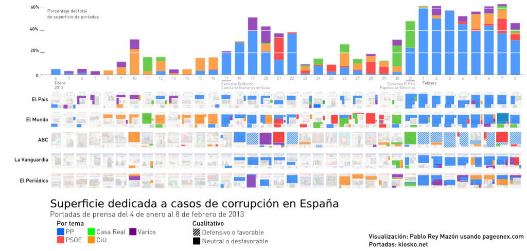
El listado de casos de corrupción activos es muy grande pero principalmente afecta a los tres partidos con mayor representatividad parlamentaria: PP (azul), PSOE (rojo) y CiU (naranja). Creé otra categoría para la Casa Real por el caso Nóos y Urdangarín (verde) e hice un quinto grupo para agrupar otros casos de corrupción, como los problemas de control de cajas de ahorro por el Banco de España, que integraba también otras noticias generales sobre el estado generalizado de corrupción.
Cada noticia se clasificaba en función del caso de corrupción, asignándoselo a la institución/partido principalmente implicado en él. De este modo podíamos visualizar la atención que cada medio dedicaba a la corrupción de cada partido; sin embargo, esto no bastaba para entender si la información era presentada favorable o desfavorablemente. Por ello, se añadió una capa cualitativa al análisis ¿eran las noticias neutras o desfavorables, o por el contrario favorables o defensivas?
Resultados
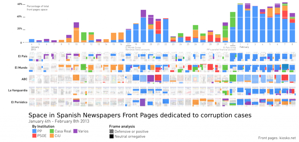
Superficie dedicada a casos de corrupción clasificado por partido/institución en El País, El Mundo, ABC, La Vanguardia y El Periódico. Del 4 de enero (izq.) al 8 de febrero (dcha.) de 2013.Superficie acumulada de noticias dedicadas a corrupción por periódico. La escala vertical es en portadas (1 = una portada entera). 4 de enero al 8 de febrero de 2013.
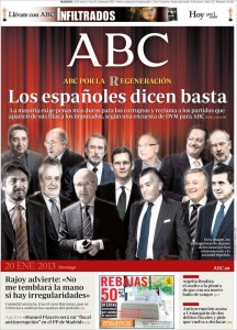
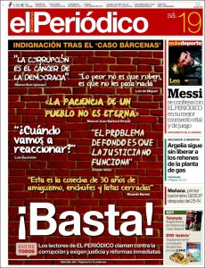
El caso de los papeles de Bárcenas y la posible financiación ilegal del Partido Popular eran algo demasiado importante en ese periodo como para ser ignorado. Marcó la cobertura y color en todos los medios, incluso en los periódicos conservadores, habitualmente afines al PP. Para amortiguar el “daño” que una noticia así podía causar emplearon otras tácticas diferentes a silenciar el caso. ABC (aunque también La Razón y La Gaceta, que quedan fuera de este estudio) defendieron la actuación de los populares utilizando varios métodos: dar razones para situar a Bárcenas fuera del PP, declarar falsos los “papeles de Bárcenas” o apoyar los proyectos pro-transparencia de Mariano Rajoy y otros miembros del partido. En los días posteriores a la noticia de las cuentas suizas de Bárcenas, estos mismos periódicos coincidieron también en dedicar al menos una portada a la ‘corrupción’ en genérico, la corrupción como un mal generalizado que afecta a todos los partidos. Algo parecido hizo también El Periódico, mostrando la indignación de sus lectores ante la corrupción generalizada.
Portadas de varios periódicos tratando el tema de la corrupción como mal generalizado. La Gaceta y ABC publicaron collages con corruptos de todo signo político.
Periódico por periódico
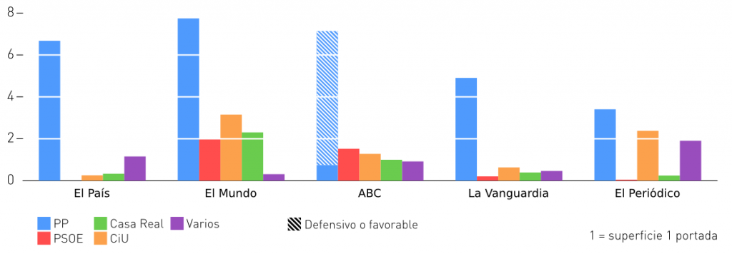
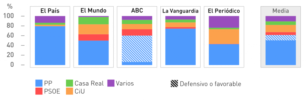
Porcentaje de superficie que cada periódico dedica por partido/institución sobre el total de artículos de dicho periódico sobre corrupción durante el periodo estudiado.
El País “azul”
Media dedicada a corrupción por día 23%
El País dedica su cobertura de la corrupción fundamentalmente al azul PP (80% del total) con algunos pequeños toques verdes Urdangarín y Revenga, CiU y la supervisión de los inspectores del Banco de España. El rojo PSOE no aparece por ningún lado, congruente con su alineación política de centro-izquierda y afinidad socialista. Su cobertura de casos de corrupción es constante, en torno al 10-20% cada día. Después de publicar su exclusiva sobre papeles de Bárcenas, dedica entre un 40% y el 70% de su portada al caso en los día siguientes.
El Mundo “multicolor”
Media dedicada a corrupción por día 43%
Comienzan con naranja CiU (20% del total), luego llega el periodo azul PP (50%) con las cuentas de Bárcenas en Suiza que ellos mismos destapan, todo ello combinado con toques de rojo PSOE (13%) por el caso Amy-Mulas y verdes Urdangarín (15%). Al final vuelve a los papeles de Bárcenas empujado por la exclusiva de El País. Desde después del 6 de enero no hay día que no hable de algún caso de corrupción, dedicando habitualmente 20% y el 30%, y superando muchas veces el 60%. Es el periódico que más espacio dedica a la corrupción, con el 43% de todas sus portadas.
ABC “azul”
Media dedicada a corrupción por día 33%
Por las características de maquetación su portada, con una imagen que lo ocupa casi todo, tiene siempre mayores porcentajes que el resto de periódicos, superando a menudo el 50% de cobertura, hable del tema que hable. Después de la aparición de las cuentas en Suiza de Bárcenas le dedica dos portadas enteras seguidas: “El PP debe aclarar la verdad del caso Bárcenas” para al día siguiente “En el PP quien la hace la paga”, lo cual indica la estrategia de defensa del PP que habrá de seguir en los siguientes días. Al día siguiente “ataca” al PSOE sacando a Griñán (PSOE) y sus EREs. Días más tarde, el 22 de enero, titula “Luz y taquígrafos” para anunciar que Rajoy realizará una auditoría externa e interna para “zanjar especulaciones”. De este modo el ABC ha seguido todas las modalidades posibles de defensa: atacar al enemigo, y defender al partido afín. Cierra el periodo con unas fotocopias hechas trizas con el titular: “Las fotocopias que pusieron en jaque a España se desmoronan”.
La Vanguardia “azul”
Media dedicada a corrupción por día 18%
De todas las noticias que dedica a corrupción La Vanguardia dedica un 75% de su cobertura al PP. Puntualmente cubre la imputación del secretario de las infantas o los trámites para acusar de cohecho a Crespo (CiU), todas ellas basadas en noticias judiciales. Cabe destacar que de los 36 días a estudio, en casi la mitad (17 días – 47%) no tuvo noticia alguna sobre corrupción. Le siguen de cerca El Periódico (14 días – 38%) y ABC (12 días – 33%).
El Periódico “azul” y “naranja”
Media dedicada a corrupción por día 22%
El Periódico dedica mayoritariamente su cobertura de la corrupción al PP (50%) y a CiU (30%). Es significativo que dedique un cuarto de las noticias sobre corrupción a hablar de este tema en general, con titulares como: “Los jueces reclaman más medios contra la corrupción”, “Los partidos están obligados a mover ficha con la transparencia” o “#MásDemocracia”. Es relevante también la casi ausencia del PSOE con un 5% del total de superficie.
—
El análisis de este mes de enero permite comprobar el alineamiento de los periódicos esperado, como el silenciamiento de los casos del PSOE por El País o la defensa del PP por parte de ABC. También muestra cómo los periódicos generalistas de ámbito español están dedicando más espacio en sus portadas a la corrupción que los catalanes: El Mundo dedica un 43% de su portadas (El País 23%, ABC 33%), frente a un 22% de El Periódico y un 18% de La Vanguardia. En cualquier caso todos reflejan los viejos y nuevos casos de corrupción de una clase política que lleva mucho tiempo en el poder.
Algunos medios están desempeñando un papel muy importante a la hora de destapar esos casos de corrupción, mientras que otros informan sobre casos ya judicializados. En cualquier caso, casi todos dejan de cubrir, o lo hacen pero dedicándoles menos espacio, los casos de los partidos “amigos” o más afines.
Solo un ciudadano bien informado, con una dieta informativa que incluya todos los colores, podrá escapar de la visión partidista de un solo periódico. Los nuevos medios de comunicación digitales en España (entro otros El Confidencial, lainformación, el diario, La Marea o InfoLibre) o los agregadores de noticias, donde los usuarios votan cuales pasan a portada (reddit, meneame), podrían ayudar a romper esa visión predominantemente monocolor de los medios traicionales ligados estrechamente a partidos y empresas. La ley de transparencia, que no acaba de llegar, y de la cual se desconoce si tendrá un alcance real y efectivo, ayudaría también a reducir los casos de corrupción. Mientras, solo nos queda seguir buceando entre periódicos y mantener los ojos bien abiertos.
–
Escrito por Pablo Rey Mazón. Parte de este texto proviene de una artículo en preparación con Sasha Costanza-Chock.
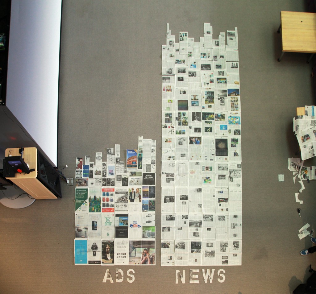
Buy two copies of the same edition of one newspaper. You need two copies to be able to display both sides of every page. We used the exterior side of the papers from one copy, and the interior from the other copy.
To be cautious, we marked (draw a thin line) in the side of the paper that we were not going to use, to avoid having a piece of paper and not do not know which side is the one to use.
Cut and separate Ads and News.
Once you have the two piles with Ads and News, you have to make the bar charts. Keep’em straight and make them have the same width. To make the puzzle easier we put all the full (uncut) size pages together at the bottom of the bars.
Anybody up for doing other newspapers?
Some pictures of the process:
Starting to read an cut.Rearranging.Happy and beautiful people vs other stuff.Section A of the newspaper. The ratio is less than 2:1.The makers.Horizontal style.
This article will be part of the forthcoming book Accountability Technologies: Tools for Asking Hard Questions edited by Dietmar Offenhuber and Katja Schechtner. It is based on previous published texts about PageOneX. It wants to be a short summary of the possibilities of the tool that has just been released: PageOneX.com
There is an article in preparation with Sasha Costanza-Chock that will provide a review of scholarship in this area (print newspaper coverage) and will describe our approach in-depth to the topic.
Newspaper Front Page Analysis: How Do They Tell the Story?
1. Introduction
Social Networking Sites (SNS), especially Twitter and Facebook, have played an important role in the current global social movement wave, from the Arab Spring to the Occupy movement in the United States. Social movement actors use SNS, among other tools, to document, promote, support and, in some cases, to coordinate movement activity. SNS have also become key sources of information for observers, both supporters, detractors, and non-participants, as well as for professional journalists working within print, broadcast, and online media, whose reporting strategies have, in some cases, shifted towards curating and incorporating content first circulated via SNS. In the context of increasingly transnationalized media firms and cross-platform convergence, information rapidly flows back and forth between SNS and mass media.
Print newspaper coverage also has an impact far beyond paid subscribers or readers, since it greatly influences broadcast (television and radio) news agendas; newspaper coverage also plays an important agenda-setting role for blogs and social media. The complexity of the converged media ecology requires new approaches to newspaper content analysis, which has long been used by social movement scholars as a proxy for social movement activity. This essay describes an innovative approach to the analysis and visualization of front page newspaper coverage.
2. Background: How Did I Start Coding Front Pages?
On Sunday May 15th, 2011, one week before the municipal elections that were taking place all around the country, there was a grassroots-organized march in many cities in Spain under the motto “Real Democracy Now” (Democracia Real Ya[ref]Democracia Real Ya was not only the motto, but also the citizen platform to deepen in democratic values http://democraciarealya.es[/ref]). By then, I was living in Boston and closely following all these events through the Internet.
Tens of thousands of people throughout Spain marched on the streets during what later would be known as #15M, the #SpanishRevolution or the ‘indignados’ movement. The movement was inspired by the Arab Spring and the Icelandic Revolution and was preceded by previous social mobilizations in Spain. The country was in the midst of a huge economic crisis and suffering from austerity measures that were dismantling the welfare state. The crisis was related to the world economic recession and to the bursting of the real estate bubble. In the short term, this new mobilization was related to #nolesvotes[ref]#NoLesVotes (Do not vote for them) was the hashtag used in Twitter to promote this cyber movement. First used against the “Ley Sinde” law (Ley de Economía Sostenible [Sustainable Economy Law], March 2011), which opened the possibility of Internet censorship. That led to a second stage of the online movement that urged a change in the electoral system to fight bipartisanship, “Do not vote for them” was their motto, referring to the parties that approved the law. “Les” also meant “Ley de Economía Sostenible.”[/ref], a mobilization launched and forged on the Internet against Internet censorship that a new law was enforcing. In the years before, there had also been other mobilizations similar to the Democracia Real Ya platform involving demonstrations on the streets throughout the country, among others: Juventud sin futuro[ref]Started in Madrid in February 2011, “Youth without a future” is a citizens’ platform to address the problems of the precarious situation of the youth during the economic crisis juventudsinfuturo.net.[/ref], to protest the precarious situation of the youth; Por una vivienda digna[ref]Started in Madrid in 2003 during that year’s real estate bubble, “Right to housing” is a citizens’ platform to address housing problems viviendadigna.org.[/ref], a citizens’ platform created during the real estate bubble crisis to address housing problems.
Democracia Real Ya was a grassroots movement that received no supported from any party or union. It was a decentralized organization based on the Internet that opted for a multi-site demonstration, instead of the traditional march in the capital (Madrid). No flags were used and the “ghosts” of the two Spains from the Civil War; today’s two major political parties were also absent. Despite the movement’s success, the mainstream media did not pay much attention: It was just another demonstration in an electoral period.
That Sunday night after the march, around 40 people decided to stay in Puerta del Sol, the central square of Madrid. They wanted to keep on with the mobilization, and managed to convince the police to let them stay in the square during the night. After their first general assembly, they started organizing the first working groups. On the next day, many more people came to show support, and around 300 stayed on to sleep in the square. At 5 a.m. the police evicted them, an act that proved to be the tipping point of the movement. On Tuesday evening, more than 10,000 people crowded into the Puerta del Sol to protest the eviction. By that time, I was absorbed with the #acampadasol hashtag in Twitter, the 24-hour live streaming from soltv.tv, and trying to follow every bit of information about what was happening in my hometown of Madrid.
This data visualization shows the front pages of 6 Spanish newspapers from Sunday, May 15th (up) through Friday, May 19th (down), 2011 in chronological order. The highlighted orange area indicates the articles about the 15M movement. Original image in yfrog.
Some major newspapers were covering the events, but people in social media, mainly Facebook and Twitter, argued that they were not getting enough coverage. On Wednesday, May 18th, the electoral board in Madrid denied the right to march or gather in the square, Junta Electoral Provincial de Madrid (2011), and that made the protests even more successful than the previous days: Puerta del Sol Square was full again. I tried to visualize the subsequent reactions of the mainstream media to this new event and tweeted my first newspaper front page data visualization.
On Thursday morning, May 19th, media attention was completely centered on the occupied squares: The protests started filling all the front pages only after the fourth night at Puerta del Sol, after the “tent cities” had already spread all around the country. The front page data visualization became popular after appearing on Menéame, a Spanish news aggregator site, as it showed the very moment when the protest entered the mass media loop in an easy and comprehensible way. Indeed, it was used by bloggers to reflect on how the media had waited too long to cover the protests. Some journalists also used it to think about how the media should cover these kinds of protests. The following Sunday, one week after the mobilization had started, the elections took place, but the camps and the spirit of change from the 15M movement remained.
The 15M movement was now live on the streets and ready to grow and take infinite shapes and ways of protests. My front page analysis was also making its first steps, and I was ready to start diving into it and testing its possibilities.
How Are Social and Mass Media Related?
Twitter is the tool researchers most frequently use to study information flows that Social Networking Sites enable, because these streams of information are open, allowing anyone to study their data. Facebook is arguably a more important site for spreading news, based on its far higher penetration rate, but as a closed network, the study of the data has not been as easy as with Twitter. We have used front page newspaper coverage analysis to compare newspaper coverage of recent mass protests with social media attention, in particular, in Twitter.
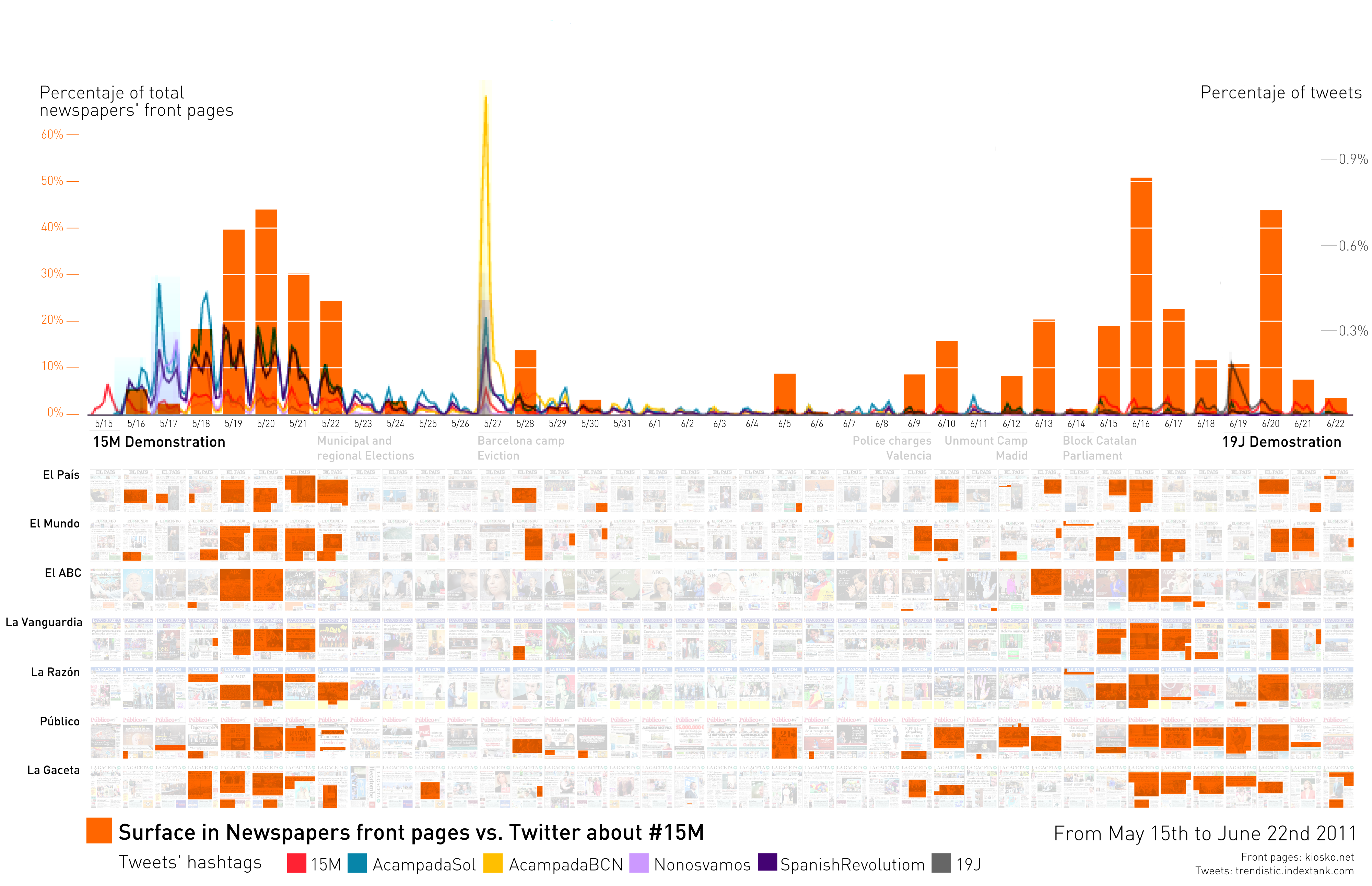
For example, we have compared the use of popular hashtags, the way message “tweets” are tagged in Twitter, in the 15M movement. The most popular hashtags were #acampadasol, #15M, and #spanishrevolution. We have compared the total number of tweets using these hashtags with the front pages of 7 major newspapers in Spain. These hashtags had been selected among those most used at the time regarding this movement according to research by the Complex Systems and Networks Group at the University of Zaragoza (BIFI). The Twitter data came from Trendistic, an online Twitter data visualization provider.
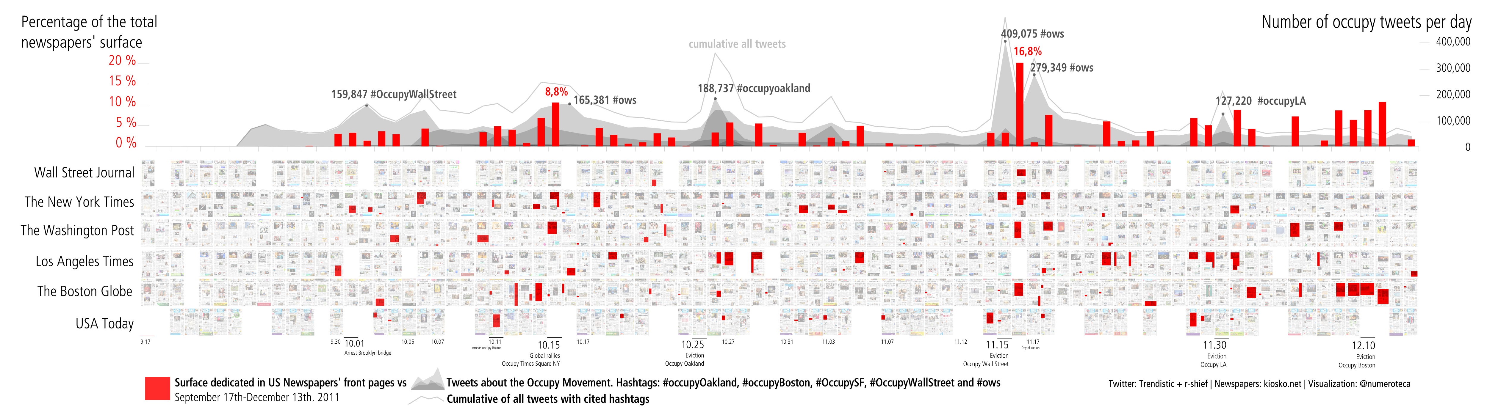
Surface dedicated to the 15M movement in 7 Spanish newspapers. Above is a line chart displaying the use of certain hashtags related to these social movements extracted from [link no longer works] http://trendistic.indextank.com/. From May 15th (left) through June 22nd (right), 2011.A similar data analysis has been made with the Occupy movement with US newspapers. In this case, the chart above displays both the percentage of surface dedicated to the Occupy movement (red) and the number of tweets from the various related hashtags like: #ows, #occupywallstreet, #occupyLA, #occupyOakland or #occupyBoston.
Surface coverage in newspapers front pages vs. Twitter about Occupy from September 17th through December 13th, 2011.The tweets per day come from the data released by r-shief.org in the context of the #occupydatahackathon.
Tweets are instant messages that cover events almost in real time. On the contrary, front pages cover the news of yesterday. Therefore, it is normal to see how different media react to the same event: Twitter coverage peaks the day that it occurs, and press coverage peaks the day after. Following this idea, it is more interesting to explore when Twitter and the press differ: When enormous tweet traffic about an event or action is not followed by that big coverage, or when a week-long, sustained conversation in Twitter around a hashtag doesn’t find its way into the print.
3. The Front Page Data Visualization: Building a Tool
The first data visualization started as “manual” process: I downloaded the images one by one from kiosko.net, a website providing newspaper front pages from all around the world, and built the array of images with Inkscape, a vector graphics program. Later on, after the good acceptance of the visualization, I started building a script to allow others to replicate this kind of analysis. Around a year later I started PageOneX, a free software tool (code available in github), designed to aid the coding, analysis, and visualization of front page newspaper coverage of major stories and media events.
PageOneX constitutes a straightforward way of interpreting front pages, a very specific piece of the media ecosystem that has direct influence on radio and TV broadcasts. In the past, researchers trying to analyze front pages needed to obtain copies of newspapers, measure column-inches by hand (with a physical ruler), and manually input measurements into a spreadsheet or database. This laborious and time-consuming process would be followed by calculation, analysis, and sometimes data visualization. Some of these steps can now be automated, while others can be dramatically simplified.
The process described here is designed to facilitate the relatively rapid creation of “small multiple” data visualizations of front page newspaper coverage. “Small multiple,” a term popularized by Edward Tufte, is a kind of data visualization that allows the visual comparison of multiple series of data: Series are displayed separately and placed next to each other. In the case of PageOneX, the displayed data include small images of the newspaper front pages themselves, as well as the surface area on the newspapers’ front pages dedicated to a specific news story (a “thread”) that runs chronologically along the x-axis (time). Coders manually select the portion of front pages dedicated to that thread. The selected areas are then displayed as shaded or colored transparencies on top of their original front pages. When viewed at sufficiently close range (zoomed in to a story), the text of the original stories that have been coded can still be easily read. However, this form of graphical information display is most compelling on a larger scale: Small thumbnails of the newspaper front pages are arrayed chronologically from left to right, and the viewer is then easily able to see at a glance the evolution of the coverage – or lack of coverage – of a particular news thread over time, as well as to compare different newspapers.
The visual approach allows the reader to have a sense of the coverage and, at the same time, have a look at the very raw data of the analysis, which are the components of the article, whether they be images, headlines or text. These highlighted areas could also be quantified to produce a bar chart. To make the measurements of the areas of news coverage comparable among different newspapers sizes, we use the percentage of used surface, and not the real area in mm².
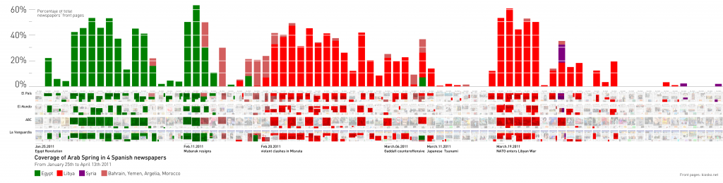
The basic visualization of this type of graphic displays both the data itself (front pages and highlighted surfaces) as well as the measurement (the percentage of surface area) in a bar or line chart. Bar charts give a more accurate view of the surface devoted to the story, whereas line charts (see below) appear as a more continuous timeline, although they run the risk of suggesting a visual interpolation of discrete data. In other words, newspaper front pages provide one surface area datum per day, so a line connecting 2 surface area data points (from two consecutive days) produces a false sense of continuity. Line charts are useful, however, to compare more than 2 news threads over a long period of time, like the Arab Spring coverage (Egypt, Syria and Libya). When different topics are displayed one beside the other, it is a good way to study the battles for attention in the media; how related news “fight” for a position on page one, like in the Arab Spring coverage (Egypt, Syria, Libya and others) in Spanish newspapers.
Percentage of space used to display news regarding the “revolutions” (Egypt, Libya, Syria and others) in the Arab Spring in 4 Spanish newspapers front pages.
We can see how the media space is usually focused on one “revolution” at a time, and that there is not much juxtaposition of news about this topic.
We observed a big drop in the Arab Spring coverage on April 13th, because the Japanese tsunami was breaking news: Note how the green area (Japanese tsunami) “hides” all the other news related to the Arab Spring for a week. It is not the case that “nothing” related to the Arab Spring happened during that week, but rather that the media decided where to pay attention. News on front pages “fights” for space and its areas are related to one another.
Comparing Asynchronous News Coverage in Time
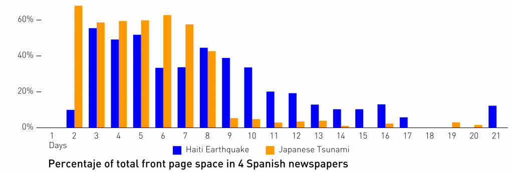
The relative measurement of the surfaces lets us not only compare different news from different newspaper sizes, but also from asynchronous timelines. This method would allow the measurement of the news cycle: enabling us to understand how long news lasts on the front pages and how similar events attract the attention of the media.
In the comparison of the surface coverage dedicated to the Haiti earthquake (day 1 = January 12th, 2010) and the Japanese tsunami (day 1 = March 11th, 2011) in 4 Spanish newspapers, we could measure and compare the length of the coverage. Remarkable is the rapid drop of the Japanese crisis coverage after day 8 (March 18th, 2011), caused by the UN’s authorization allowing the international community to enter the war in Libya.
Semantic Analysis of News Content
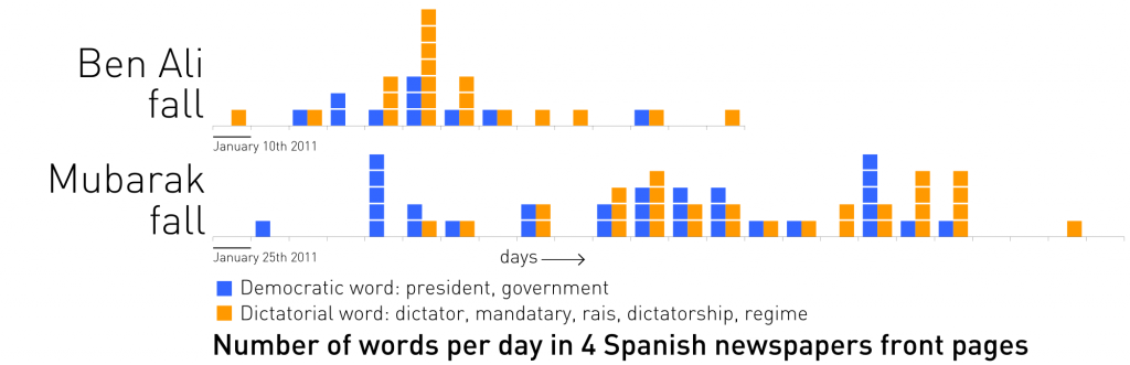
It is also possible to make an automatic estimation of the article’s content based on semantic technologies. This process would benefit from the automatic transcription of scanned newspaper front pages through optical character recognition (OCR). The graphic displays the number of times that certain words have appeared during the fall of Mubarak and Ali. Grouped under “democratic” and “dictatorial” groups, January and February 2011.
The fall of Ben Ali (Tunisia, orange) and Hosni Mubarak (Egypt, green) in 4 Spanish newspapers from January 10th through February 17th, 2011. More info.
As a case study, we used the fall of Mubarak and Ben Ali to compare how newspapers framed their last government/regime days. We analyzed the number of times that certain words appeared on the front page, and grouped them into two pools:
The aim of this study was to measure how newspapers are shifting their vocabulary along time, depending on their support / alignment with the issue they are covering. In Mubarak’s fall, we can see how newspapers shifted their frame during the crisis from a predominant use of democratic words (president, government) to more dictatorial ones (dictatorship, dictator, regime). In the case of Ben Ali, more “dictatorial” types of words were employed to describe his last days in power.
Content and Frame Analysis
We have seen how articles can be categorized, then colored and quantified, by multiple taxonomies related to their content: a particular thread or categorized by country. To understand how newspapers are addressing one topic would be not enough to understand how much they are covering it. We will need a framing analysis of their coverage: Are they positive/neutral/negative about it? Are they supportive? How biased is the information they provide?
We used this approach to analyze how different Spanish newspapers were covering corruption cases. The fast-growing list of corruption investigations in Spain contained almost every institution in the country. Everyday, new information and a new cases were being unveiled, provoking an increasing sense of indignation. It was also true that the levels of indignation had reached an apex, that they caused either incredulity or insensitivity.
The hypothesis and common ground knowledge is that every Spanish newspaper is aligned with a political party. Newspapers follow the corruption cases of the “opponent” parties. Measuring front page coverage seemed to be a good proxy to analyze their political agendas and to verify the hypothesis. I selected the most important Spanish newspapers and highlighted the stories related to the different corruption cases during a one-month period.
In January 2013, the El Mundo and El País newspapers reported that the ex-treasurer of the ruling party (Partido Popular, PP), Luis Bárcenas, had a $29 million Swiss account, and then published excerpts from the party’s parallel financial account. Both scoops impelled all the other newspapers to talk about the same PP corruption case, although other corruption cases affecting the main parties were also on the media menu. We coded the corruption cases from the major three parties: PP (conservative), blue; PSOE (center-left social democratic), red; CiU (conservative Catalan nationalist), orange; the royal house, green; other cases, purple.
Both newspapers, El Mundo and El País, are in opposite political spectrums, but made a common effort in this case to cover the Bárcenas story affecting the conservative party (PP) in the government.
El País centered its coverage on the PP (blue), leaving little space to the CiU (orange) or the monarchy (green), and none to the PSOE (red), following the expected behavior of a party related to the PSOE and the center-left. Meanwhile, El Mundo had a colorful timeline illustrating all the major corruption cases. Since the newspaper tends to defend the PP and attack the PSOE, it represented a change in their agenda.
However, some things did not fit into the alignment of mass media with certain major political parties that we could have expected. All of the newspapers were talking about the PP corruption case, but not in the same way. To understand how they were framing the story, we needed to add a new layer to the visualization: The issue of whether newspapers were framing corruption neutrally or negatively (plain areas) or defending and giving a positive view (striped areas).
A conservative newspaper like ABC (2nd row) dedicated their entire front page to the PP corruption case, but after the first news proclaimed that “PP must tell the truth about the Bárcenas case,” they started defending the actions the PP was taking. As expected, other conservative newspapers (La Razón, La Gaceta, but not El Mundo, which had published the scoop) took a defensive position (Jan. 19-20). It is also worth noting that once El País released the excerpts of the parallel financial account (Jan. 31), La Gaceta, a far-right newspaper, stopped defending the PP.
I published a blog post about this case study that garnered a lot of attention in the social media sphere (Twitter). It is worth mentioning that El Mundo published a piece on this research: “El Mundo, the newspaper that covers all corruption cases” in a four-column headline[ref]“A study by the prestigious MIT in the US shows that this newspaper stands out in the Spanish press for investigating the political parties without exception”. . [/ref]. They were interested in showing how the data visualization supported their unbiased work, and redrew the graphic to show El Mundo in first place.
In Spain, mass media are usually blamed for maintaining and supporting the bi-partisan system[ref]PP-PSOE, both parties are the ones entangled in more corruption cases; check the Corruptódromo map.[/ref]. This time, however, some newspapers were playing a fundamental role in unveiling corruption cases, but most of them only kept reporting about certain corruption scandals. Only a well-informed citizen who escapes the biased point of view of his/her reference newspaper can get the full picture of what is happening and react accordingly.
4. Conclusion
The method for analyzing newspaper front pages that we have described here, as well as the PageOneX.com platform, provide a straightforward way to analyze and visualize news attention to specific stories over time, across or between newspapers. In the future, we imagine either extending this tool or connecting it to others focusing on other media platforms, such as TV[ref] Archive.org is making the TV searchable by recording TV images and captions in a public archive: http://archive.org/details/tv .[/ref] and radio broadcasts, or to the online versions of newspapers and social media.
Content analysis, and newspaper content analysis by amount of coverage, has had a long history in the field of communication studies. New tools are enabling novel approaches to this kind of analysis. Some aspects of newspaper content analysis can be automated, some can be distributed (crowdsourced), some can be done much more quickly by human coders using sophisticated new interfaces. The data produced by such analysis can also be visualized in new ways, and compared against data from other new sources of information flow such as social media. This essay has explained the approach we have taken with PageOneX, demonstrated its application to several specific stories, and suggested areas for further work. We hope that PageOneX provides a valuable example to anyone interested in monitoring the media: communication scholars, social movement activists, or advocacy organizations.
We invite anyone interested to contact us and to participate in the future development of the platform.
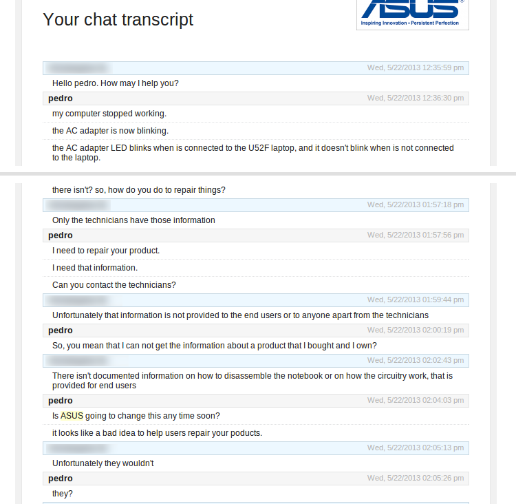
Days ago my U52F ASUS laptop stopped working. I tried to repair it: opened it, bought some pieces, but it didn’t work. I contacted, one more time, the ASUS support service. This is our chat:
TL/DR*: ASUS doesn’t provide their disassemble or technical information to end users.
Joseph K. Wed, 5/22/2013 01:23:24 pm
Hello pedro. How may I help you?
pedro Wed, 5/22/2013 01:23:57 pm
my computer stopped working.
the AC adapter is now blinking.
the AC adapter LED blinks when is connected to the U52F laptop, and it doesn’t blink when is not connected to the laptop.
I have no battery. it died months ago
the light of the led is green
Joseph K. Wed, 5/22/2013 01:25:01 pm
I apologize about this issue your having and I’m more than happy to assist you with this.
pedro Wed, 5/22/2013 01:25:20 pm
the laptop is out of warranty
Joseph K. Wed, 5/22/2013 01:26:02 pm
For hardware issue you would be required to have the notebook sent in for servicing
pedro Wed, 5/22/2013 01:26:31 pm
did I talked with you before? the chat closed before I could answer
you were saying “It could be that the board was damaged in the replacement process”, but I didn’t touched the motherboard at all
ad the problem started before I replaced the jack board
Joseph K. Wed, 5/22/2013 01:28:02 pm
This means the issue is with the motherboard, since the DC port was changed
pedro Wed, 5/22/2013 01:29:02 pm
I see
Joseph K. Wed, 5/22/2013 01:30:04 pm
Would you like an RMA to be created to have the notebook sent in?
pedro Wed, 5/22/2013 01:31:39 pm
I am trying to avoidsending it and repair it myself. I can not afford the cost.
there is no other thing I can do?
it can only be the motherboard?
Joseph K. Wed, 5/22/2013 01:32:29 pm
Unfortunately the motherboard may need to be changed
You have changed the charger and the DC port, which leaves the motherboard
The motherboard is definitely the issue
pedro Wed, 5/22/2013 01:33:52 pm
is there somethig to be seen in the motherboard?
are there users with the same issue: blinking adapter when switching in?
Joseph K. Wed, 5/22/2013 01:36:51 pm
This is the first I’m hearing of this issue
I haven’t heard from you for a few moments. Are you still with me?
pedro Wed, 5/22/2013 01:41:43 pm
yes iam here
no report by no one else?
Joseph K. Wed, 5/22/2013 01:43:13 pm
Had issues where the light doesn’t come or the notebook doesn’t charge, but not a blinking light
pedro Wed, 5/22/2013 01:45:56 pm
I was meaning: not only that you heard, but anyone at ASUS
Joseph K. Wed, 5/22/2013 01:47:08 pm
Unfortunately not, it’s recommended to have the notebook sent in
pedro Wed, 5/22/2013 01:48:41 pm
I can not find any manual online about my notebook.can you provide one to me?
at least of the affected parts
Joseph K. Wed, 5/22/2013 01:51:01 pm
You can go to our support site http://support.asus.com/Downlo…5350_U53_43_33_UM_printing.zip
pedro Wed, 5/22/2013 01:51:45 pm
where to look there?
Joseph K. Wed, 5/22/2013 01:52:21 pm
You can follow the link I provided
pedro Wed, 5/22/2013 01:53:17 pm
mmm, this is just a user manual, I need something more technical
it doens’t have any info about what is inside
Joseph K. Wed, 5/22/2013 01:55:19 pm
Unfortunately there isn’t pedro
pedro Wed, 5/22/2013 01:55:47 pm
there isn’t? so, how do you do to repair things?
Joseph K. Wed, 5/22/2013 01:57:18 pm
Only the technicians have those information
pedro Wed, 5/22/2013 01:57:56 pm
I need to repair your product.
I need that information.
Can you contact the technicians?
Joseph K. Wed, 5/22/2013 01:59:44 pm
Unfortunately that information is not provided to the end users or to anyone apart from the technicians
pedro Wed, 5/22/2013 02:00:19 pm
So, you mean that I can not get the information about a product that I bought and I own?
Joseph K. Wed, 5/22/2013 02:02:43 pm
There isn’t documented information on how to disassemble the notebook or on how the circuitry work, that is provided for end users
pedro Wed, 5/22/2013 02:04:03 pm
Is ASUS going to change this any time soon?
it looks like a bad idea to help users repair your poducts.
Joseph K. Wed, 5/22/2013 02:05:13 pm
Unfortunately they wouldn’t
pedro Wed, 5/22/2013 02:05:26 pm
they?
Joseph K. Wed, 5/22/2013 02:06:18 pm
Referring to the question you asked “Is ASUS going to change this any time soon?”
pedro Wed, 5/22/2013 02:07:27 pm
That’s what I asked: it is not “they”, it’s you, ASUS.
Joseph K. Wed, 5/22/2013 02:09:07 pm
They meaning the technicians will not provide these information to end users, which that information is not provided you technical support as well
pedro Wed, 5/22/2013 02:10:05 pm
As you can imagine, I don’t care about the different sections in your company, and your problems with information tranfer.
Christopher: my computer with all my data is dead. I need to work and you tell me that the info is there, but that you (ASUS, technicians, technical support, whatever) can not provide it.
Joseph K. Wed, 5/22/2013 02:11:23 pm
What would be required for you to do is to have it sent to us
pedro Wed, 5/22/2013 02:12:40 pm
If the only answer you can provide is: “send it to us and we’ll repair it”, you are not understanding what I am saying. Do you want me to start again?
I need more information about the ASUS computer I bought, so I can understand the problem and repair it. You (ASUS) have the information, but you are not willing to share it with me.
Joseph K. Wed, 5/22/2013 02:16:10 pm
This information is not a documented information that can be passed on
pedro Wed, 5/22/2013 02:17:06 pm
Why can not be passed on? I am your consumer, with your product.
Joseph K. Wed, 5/22/2013 02:19:46 pm
Correct and I do understand that pedro, but due to policies this information is only internal
pedro Wed, 5/22/2013 02:21:12 pm
So I guess you have very bad policies. That will be my last ASUS product, and I will write about this, although I guess I am not the first consumer who faces this issue.
Joseph K. Wed, 5/22/2013 02:22:28 pm
I wish i had more options that i could provide you with i am truly sorry about that.
pedro Wed, 5/22/2013 02:23:11 pm
I am sad that companies like yours promote e-waste.
Joseph K. Wed, 5/22/2013 02:25:32 pm
Sorry i couldn’t be of more assistance to you, Is there anything else I can help you with?
pedro Wed, 5/22/2013 02:26:37 pm
yes, I want you to read what other people are saying about ASUS: http://www.tim.id.au/blog/tims…ptop-service-manuals/#toc-asus
really sad
” I’ve called ASUS again looking for manuals, and I could no longer get ahold of the wonderful tech who helped me before. Instead I had someone tell me quite bluntly that “those manuals are our intellectual property and we will not distribute them in any way, shape or form”; after mentioning I’d had someone help me out before, they asked if I remembered who that was, because “that’s a punishable offense in this company”.”
Joseph K. Wed, 5/22/2013 02:30:41 pm
Which the information to not provided to us to provide end users with
pedro Wed, 5/22/2013 02:31:01 pm
?
I don’t understand your last sentence
Joseph K. Wed, 5/22/2013 02:33:11 pm
I was stating that the information you are requesting is not available
pedro Wed, 5/22/2013 02:33:57 pm
…to the users
can I file a complain?
pedro Wed, 5/22/2013 02:39:06 pm
One last idea:
I know you, Christopher, are not the one deciding the policies of such a huge corporationASUS = sAdSUS
I know you, Christopher, are not the one deciding the policies of such a huge corporationASUS = sAdSUS
[I sent by mistake] I know you, Christopher, are not the one deciding the policies of such a corporation like ASUS. But I want youto remember, that from now on you read once: ASUS = sAdSUS
It is sad how your company not supports repairing.
I will also remember this talk. Do you want to say your last word for posterity?
Joseph K. Wed, 5/22/2013 02:44:25 pm
I do understand what you are saying pedro and also how frustrating it may be, but we are unable to provide the information you are requesting
pedro Wed, 5/22/2013 02:47:22 pm
look for Joseph K. ASUS in google in the future! amazing help 🙂
Joseph K. Wed, 5/22/2013 02:47:31 pm
Is there anything else I can help you with?
pedro Wed, 5/22/2013 02:48:25 pm
Yes, send the manual of the u52f to my email account, once you are out of the office.
I will not tell it to anyone!
Joseph K. Wed, 5/22/2013 02:49:02 pm
The document you are requesting is not available
Joseph K. Wed, 5/22/2013 02:49:29 pm
We can only provide a users manual and it is on our support site
pedro Wed, 5/22/2013 02:49:45 pm
You might have some technicians friends
imagine: while having a coffee, do you happen to have the manual of the U52F?
it’s just a pdf
And everyone will sleep better tonight
imagine contributing in this way to the environment.
Joseph K. Wed, 5/22/2013 02:52:36 pm
Unfortunately the documentation is not available
pedro Wed, 5/22/2013 02:54:35 pm
I know that. I was imaging a different ending to this story.
Joseph K. Wed, 5/22/2013 02:55:05 pm
Is there anything else I can help you with?
pedro Wed, 5/22/2013 02:56:20 pm
Maybe tonight I will receive that email?
do you have my email?
Joseph K. Wed, 5/22/2013 02:57:30 pm
Unfortunately there wouldn’t be an email sent, where this documentation is not available
You provided your email upon entering the chat
—
Connection lost. Please check your internet connection and then try again.
Start the chat again
—
Duration: 01:34:49
Chat has been opened from website: E-mail from LiveChat
Joseph K. was used instead of the real name of the ASUS support person.
The links I sentt, Wired and Tim.id.au, thanks to voragine.net and his text on “distributed logic”.
—
Escribir, dibujar o grabar sueños es una actividad de lo más recomendable. Acabo de ver el último vídeo del Partido Popular y creo que podría ser el sueño de Rajoy después de haber pasado una mañana por La Prospe, mi barrio de toda la vida. Hay una gran cantidad de imágenes que están rodadas allí, entre otras la imagen del cielo inicial y diferentes casas alrededor de la Plaza de la Prosperidad (Madrid).
Lo que podría ser un sueño de Rajoy a su paso por La Prospe, no es más que una producción del PP para promocionar la enésima campaña de que “esto lo arreglamos entre todos” o “el curiculum de todos” de Campofrío, que esta vez se llama #juntossalimos. A ver si con esta sí que sí que sí salimos de la eterna crisis. Un montaje rápido, memeficable (buscando el viral) con muchas imágenes sugerentes, estética youtube de archivo y una voz en off que va ligando todo el discurso. Por las localizaciones que he detectado (La Prospe y Calle Fuencarral) parace un vídeo cuidado pero rápidamente hecho. No voy a analizarlo como un cabalista, pero hay dos imágenes, y el texto ligado a ellas que tienen poco de subliminales que me gustaría destacar:
“Su educación [de tus hijos]”. 1.00“Tu futuro”. 1.02
¿La parroquia como la educación de tus hijos? ¿Madrid 2020 (y van 3) como tu futuro? wtf
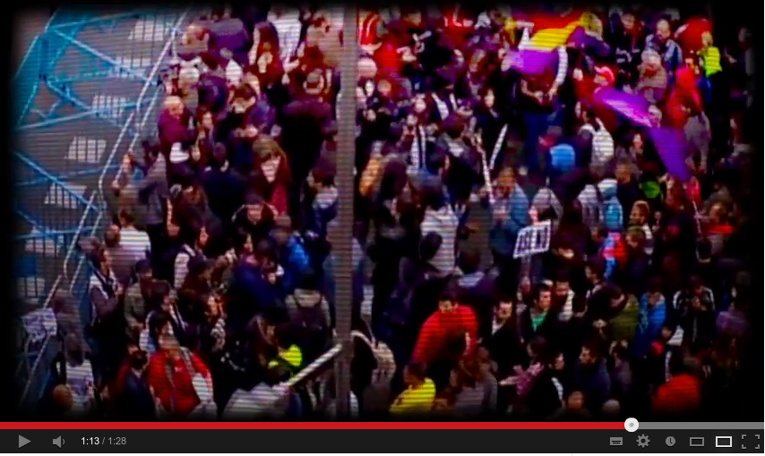
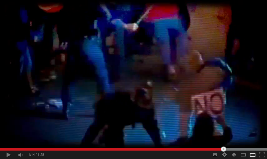
Para terminar, tras “eres lo que eliges, por tanto lo que eliges te representa” y mostrar a Adolfo Suárez, Superman, John Lennon, Steve Jobs y al Papa sale el 15M seguido de un corto fundido en negro. Se oye “pero si eliges no elegir, otros decidirán por ti” acompañando a dos imágenes de una manifestación en la Plaza de Neptuno (creo que la de “rodea el congreso” el 25S): gente frente a las ya clásicas vallas que impiden llegar al congreso (y una bandera republicana), seguido de la famosa escena street fighter del manifestante empujando a un policía.
1.13“Pero si eliges no elegir, otros decidirán por ti”. 1.28
Como era la enésima vez que leía/veía algo para desligitimar las movilizaciones sociales y a favor del sistema democrático actual, pensé que sería bueno dejarlo por escrito.


![Su educación [de tus hijos].](https://numeroteca.org/wp-content/uploads/2013/05/130505_juntossalimos-educacion_1.00.png)