
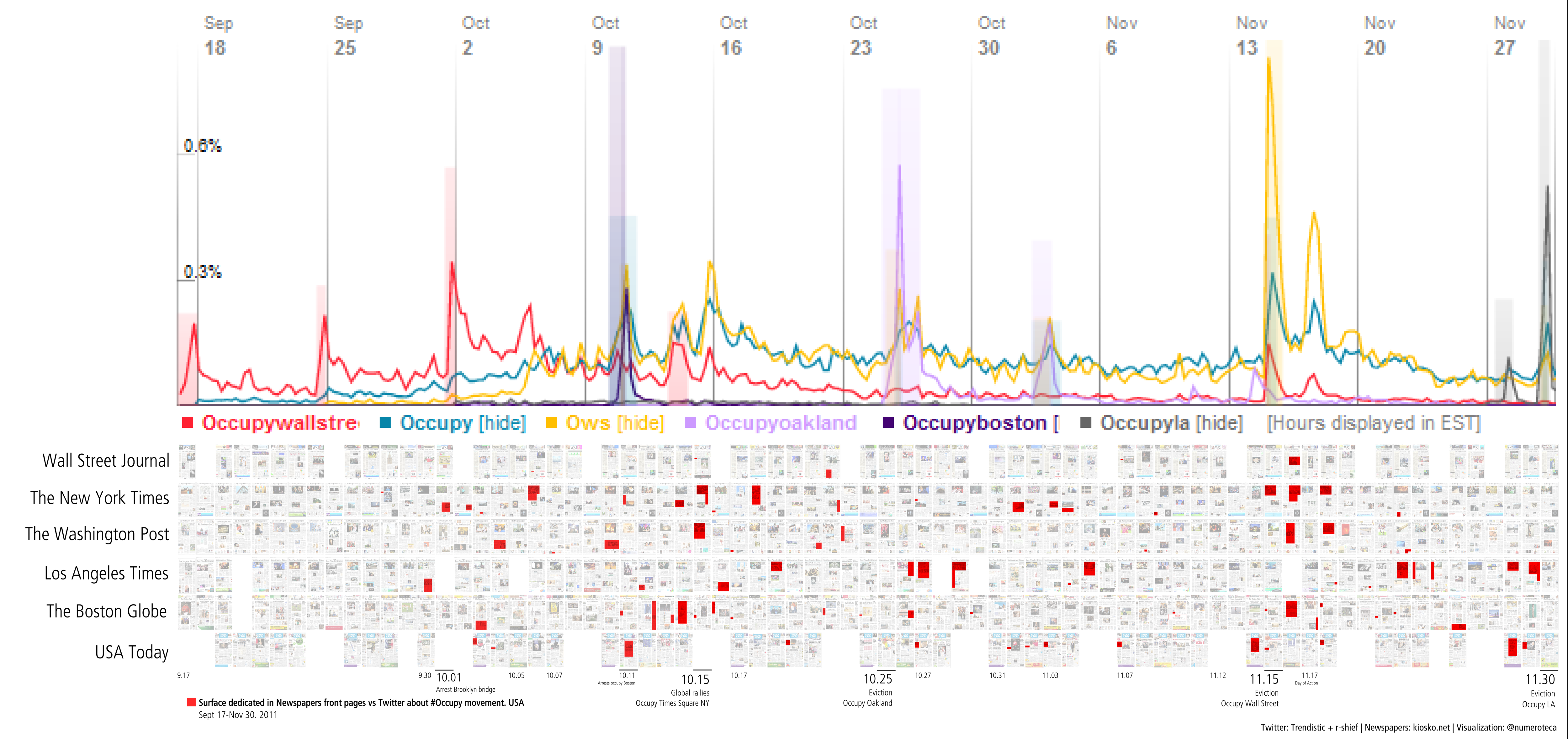
We keep making experiments with this small multiple graphic. We are now displaying the percentage of surface that #occupy is ‘using’ in the front pages of the newspapers, as making quantitative reading of surfaces is difficult for the human eye. Red bars are displaying the % of surface ‘occupied’ in the front pages.
The blue line is the number of twits with the hashtag #OWS. For the moment we only have available data from twitter from October 6th 2011. The data from Twitter are from r-shief.org who are promoting an #OccupyData Hackathon for this Friday December 9th. Find more information and join us at http://bit.ly/occupyhackathon. We will be having local sessions at the MIT Media Lab and a lecture-conference with the researchers of this investigation about Twitter and #spanishrevolution and #15M from Spain.
We are also thinking which is the best way to show simultaneously the raw data from the front pages, it’s percentage and the twits. Which vertical scales to use? number of twits by day? by the hour?
I will have more updates about this #FrontPageAnalysis project, that is still looking for a name. We have developed so far a script in Processing to generate the array of front pages.
You still can view the kind of graphic we’ve been using in the last weeks, with the twitter statistics from Trendistic.
0 thoughts on “Surface in Newspapers front pages vs. Twitter about #ows #Occupy Nov 30th”