[Update: there is a post with all the photos related to the installation Guns, Wars and Terrorism in a PageOneX real size (photo essay)]
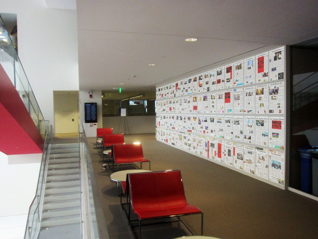
PageOneX keeps moving forward. We want to have it ready for the spring, but first we have to solve a large list of bugs and other issues. A lot to code! So much coding that we sometimes forget that paper newspapers are real objects. That’s why we want to make a physical visualization of newspapers, a 1:1 scale version of PageOneX for the MIT Media Lab Festival (April 2013).
We have yet to decide the topic/s we want to focus on and when we are going to start buying newspapers. Our original plan is having New York Times, Los Angeles Times, Washington Post and The Boston Globe.
Do you have any suggestion about which topic we should follow? When to start buying the newspapers?
We are inspired by other people that have done similar displays with real newspapers that we have came across recently:
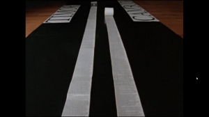
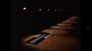
The film Manufacturing Consent: Noam Chomsky and the Media (1992) (available to watch in archive.org) by Mark Achbar and Peter Wintonick makes visual what the book Manufacturing Consent by Chomsky and Herman describes. They use as a case study the coverage of Timor war and Cambodia wars, that were happening simultaneously (1975-1979) by stitching together all the columns of text that The New York Times dedicated to each topic. Column inches is the measure that academics (and advertisers) have used to measure the amount of coverage. It was a way to show the different amount of coverage that state atrocities get, depending if they came from friend or allies states or from official enemies of the US. It is an empirical demonstration of the propaganda model.
Genocides coverage in column inches in The New York Times:
- Timor 1975 Indonesia occupation (left column: 70 column inches)
- Cambodia Khmer_Rouge, Pol Pot (right column: 1,175 column inches).
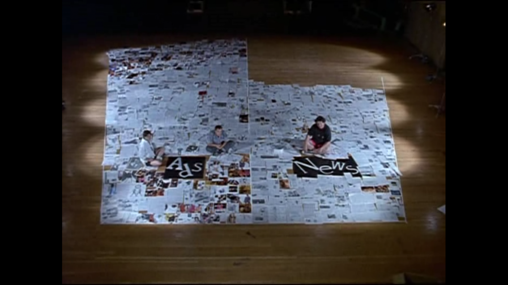
They also make a wonderful display of surface area dedicated to see the ratio of advertisement and news in a The New York Times newspaper (we are thinking on replicating this data visualization):
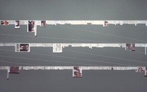
Inspired by the Manufacturing Consent film Siemon Allen made his Newspaper project. He was struck by the fact that during the same period 1975-1979 in South Africa another important event was happening “the Soweto uprisings, heightened police oppression, the expansion of separate development, and the death of many activists, including Steve Biko”. He made similar visual displays to show how was the coverage about South Africa in US newspapers:
Showing certain news in newspapers or cutting and pasting the news in long strips.

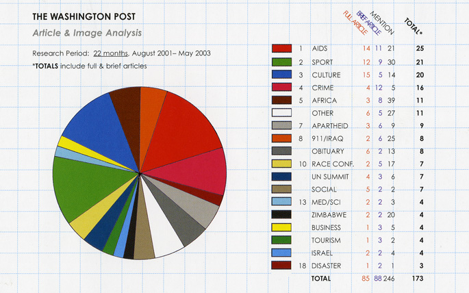
He also made standard data visualization (pie charts) when he analyzed the content of the news and classified it: aids, sport, culture, crime…
Note: The photos from the film are screenshots I took. The Siemon Allen images are all extracted from his website.
