“Si el caso es super mediático, al menos se ven obligados a posicionarse, pero estos casos que no salen en la tele los ignoran. La prensa no dice nada, la sociedad no se entera y los políticos, todos callados”.
Testimony of one of the persons benefiting from the whistleblower status of the Valecian Anti-Fraud Agency. Rodrigo Terrasa. La ciudad de la euforia. Una hipótesis de la mafia (2021)
When I started this journey, I didn’t know I was starting a research project that would take 11 years to complete.

In May 2011, while living in Cambridge, MA (USA), I created and tweeted my first visual front page analysis to track news media coverage of the then ongoing 15Mindignadossocial mobilization in Spain. I was a newcomer to Twitter back then. When the visualization was shared and well-accepted –I’m trying to avoid here “it went viral”– (Fig. 2), I was happy to participate somehow in the mobilizations from abroad. I kept on it and developed new graphics. The goal of this visualization was to show how it took days for newspapers to follow and provide this story the coverage and prominence it deserved in historical terms; it took days also for the media to realize what was happening on the streets and Twitter. The wave of mobilizations in many cities in Spain was not selected as one of the leading news stories until May 18th, i.e., three days after it started, when the social mobilization was already massive, and the squares were crowded with people.
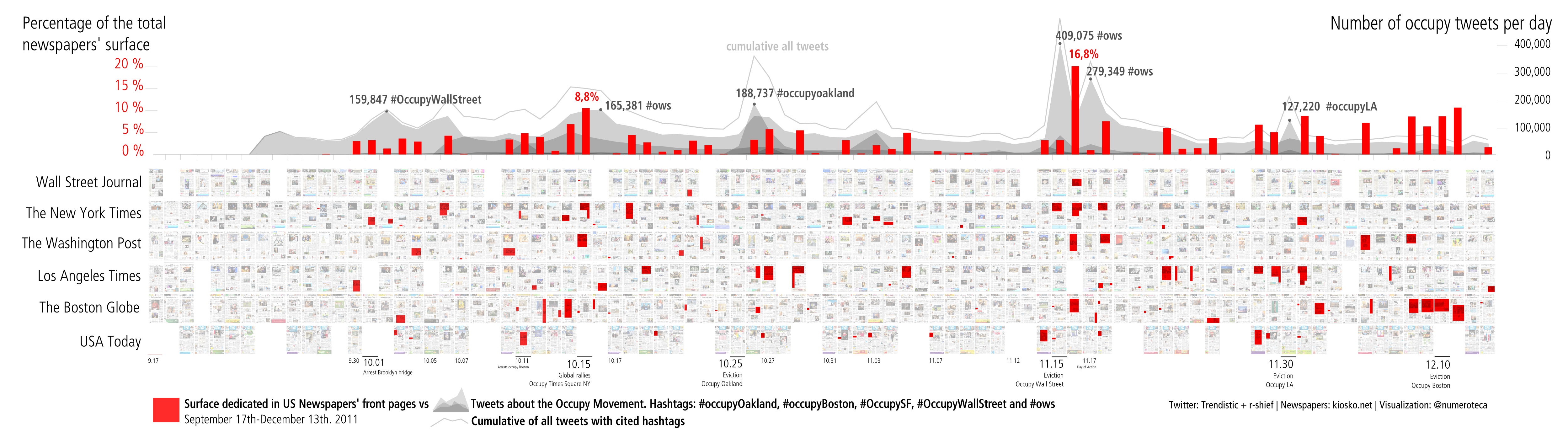
Producing these graphics involved a manual process –downloading and rearranging the images, reading the stories, drawing the rectangles– that set the basis for many other data visualizations. Later, I compared activity on Twitter with news media coverage (Fig. 4). In the case of the Spanish indignados movement, it was possible to see the days-long lag between the social media wave of tweets and front page coverage. Then came -or continued, if Arab spring is taken into account– other social mobilizations around the world, including the “occupy” movement in the USA, where I continued sophisticating the visualizations and started developing software to automatize part of the process. At that moment, I was unfamiliar with the academic literature studying these phenomena.
Almost two years went by until I could finally test the alpha version of the Pageonex software (pageonex.com), which provided a tool to allow everyone to create their front page/page one data visualizations by selecting the newspapers and period they wanted. Coincidentally, this happened just a few days after one of the biggest political and corruption scandals that have ever been uncovered in Spain: the “Bárcenas papers”, when excerpts from the parallel financial accounts of the Partido Popular (People’s Party, Spain’s main conservative party) were published by El País, the most read newspaper, on January 31st, 2013. This was the ‘hot’ topic I needed to test the tool and conduct my first online analysis. That is how I started coding front pages about corruption and shifted from focusing on social movements worldwide.
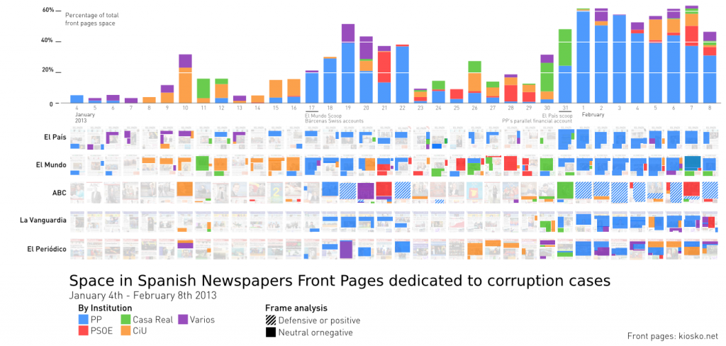
With that first analysis, I wrote an article for the Center for Civic Media blog, the lab/department at MIT Media Lab where I was in my last year as visiting scientist, “3 steps to measure the corruption coverage in Spain”. It attracted interest from the academy and news media and got me on track to further investigate news and social media coverage. I was already interested in corruption and corruption scandals, as I had been closely following the scandals related to the real estate bubble and the financial crisis that started in 2008. However, this corruption scandal analysis started something and marked a new era. I didn’t know then that that very scandal was crucial in how corruption was perceived in Spanish society. Nobody could know back how it would turn out to be a watershed in how corruption was perceived from then on.
My interest in how mass media depict reality, using data visualization as a powerful tool to display complex situations and data, and corruption as a societal problem, got me into this research field [in April 2016, the paper I co-wrote about Pageonex with Sasha Costanza-Chock was finally published, and in May, in May 2016, I gave a lecture in the “IV Jornadas de periodismo de datos“ in Madrid to test the journalist and academic communities’ interest in media monitoring]. In this “long decade”, many things have happened in the personal and the social spheres [Aaron Swartz’s suicide on January 2013, or the Cambridge Analytica scandal, made the world a lot darker and unveiled the two sides about the use of personal data, and the power of open data. I did not know Aaron personally, but many did at MIT and in Boston-Cambridge when I was there, and it had a great impact on me].
In 2015, I embarked on this PhD. In the process, I have learned and developed new tools while increasing my understanding of the complex current media ecosystem. It has been a long journey, during which I have added many new skills and programming languages to my abilities, and became acquainted with various communication theories. I’ve lived in R and Rstudio for the past years! How could I have done it without R or git, to name a few critical pieces of the technologies I’ve used? (JavaScript, R, CSS, D3, refine, rsync, t-hoarder, Twarc, Gephi, Sci-hub have also been fundamental).
In this learning process, I have also had the chance to meet many interesting people along the way. Without their help and work, this trip would not have been successful, and I would like to use this prologue to thank all of them. Thanks to Isidro Sánchez, I explored the history of corruption in Spain and how it has been a structural problem for the country since the 19th century. We wrote a book together on the topic.
This dissertation is, for me, the way to close a long research cycle and enable me to move from semi-automated front page analysis (still time-consuming, though much improved) to other, more automatized analysis. It is the link between the old, but still alive, world of paper front pages and the not-that-new-anymore world of online news sites and social media networks.
I hope my research opens the field to more accurate and in-depth studies. I also hope that the tools and datasets published together with this document enable new paths for a better understanding of information flows and how we as a society acquire information. The ultimate goal is to throw some light on how news and social media depict reality, to make us more aware of how these flows reach us and impact on our lives.
Pablo Rey Mazón
Bilbao, May 19th, 2022