Silvia Sfligiotti
silvia@sfligiotti.it
Some notes on typography and architecture
june 2005
Typography: the arrangement of type in space.
Typography is mainly applied to 2D space, but the investigationd should be expanded
to 3D space.
Why does typography applied to architecture often doesn't work?
Typographic design requires an integration between space/surface and text. When
it comes to architecture, most of the time when the design of the building begins
the typographic space is ignored, and then added afterwards when the need arises.
An example
Berlin, Velodrom and swimming pool designed by Dominique Perrault
the two buildings are almost invisible from the surroundings - they are 'hidden'
in a wide block covered with a garden, that can be accessed via staircases.
only when the visitor is on top of the staircase he can see the buildings. this
fact must have caused some confusion, because some time after the opening of
the building someone felt the need to add some huge, red Helvetica letters on
one side of the building, spelling V-E-L-O-D-R-O-M, with an arrow pointing to
the staircase.
This arises the question: can a building explain itself, with its
'architectural shape', with its simple presence in the urban landscape?
When does typography become necessary?
The problem usually comes from the fact that type is added and not designed
'with' the building
there is also a formal relationship between architecture and typography:
but the two are different languages, that cannot be easily translated one into
the other.
In the book Life Style Bruce Mau talks about the commission he received to design
the typographic interventions in the Walt Disney Concert Hall by Frank Gehry.
he did not try to reflect the shape of the building into the typeface he designed:
he chose to give the type something similar in the 'spirit', designing letters
that looked 'normal' at small sizes, and that revealed unsuspected irregularities
when enlarged.
another way to use typography on a building: the use of text as
a texture.
this doesn't only apply to architecture - it is often seen in fashion, for example.
what does this exactly mean? is it a way to add a further meaning? is it only
another kind of decoration?
Research themes
1. Use
- functional use (orientation, information, identification)
- poetic/decorative use (adds one more 'reading' dimension to the space or building
2. Shape
- 3D/structural: text shapes the building or is included in the structure of
the building. examples.
- Depero, Treves Pavillion (architettura tipografica)
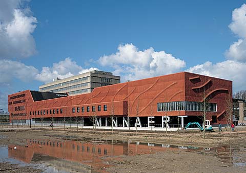
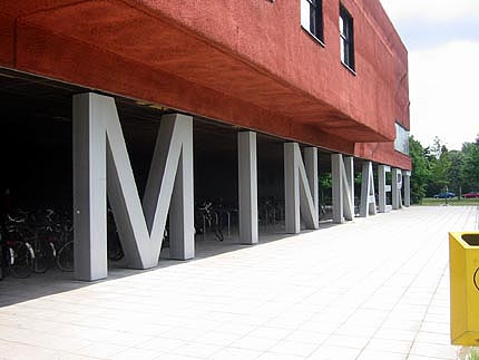
- Neutelings Riedijk Architecten, Minneart
Building y 2, University of
Utrecht, 1997
- Vittoriano Viganò, Extension of the Architecture department,
Milano (1982)
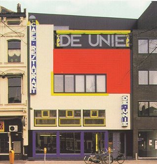
- 2D/surface. the intervention is limited to the surface of the building. the façade can become a kind of 'poster' (see J.J.P. Oud, café de Unie, Rotterdam)
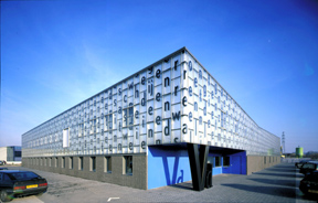
-2D + 3D: the design of the façade of the Veenman
Printing Works, at Ede, The Netherlands (1997) designed by Karel Martens.
Building of Neutelings Riedijk Architecten
[In 1998 at the Leipzig Book Fair, Karel Martens: Printed
Matter was awarded the gold medal, as the best-designed book 'in the whole world'.
Over the years his books have featured regularly in the annual Best-Designed
Dutch Books competition]
Ruedi Baur, Esisar building,
France
_______________________________________________
Discusión sobre BIG type. Tipografía y arquitectura
http://www.typotheque.com/site/discussions.php?topic=671
Silvia Sfligiotti: silvia@sfligiotti.it
<silvia@sfligiotti.it>
Alan Hart: find_edward@hotmail.com <find_edward@hotmail.com>