Here it is a comparison among different ways of making bar charts and embedding them in a wordpress blog. I’ve testing them for kulturometer.org, a project devoted to research the cultural budget that the city of Madrid is spending.
The data used: Once a year the Madrid city hall publishes a pdf with these data in a non reusable format. We’ve been extracting manually these numbers in the last 5 years and published them in a google spreadsheet (see the data set in csv format at the end of this post).
The idea of this post is to compare and review these 4 5 different methods.
Update: added gnumeric after Madeleine comment. It’s the simplest and more customizable method (though not intractive).
Google Spreadsheets
Advantages
Easy to upload data, and collaborate with others.
Easy to generate simple bar charts and embed them as images (as interactive script you may have some problems when embeding in a blog ).
No programming skills needed.
Drawbacks
Even now, that it is possible to customize a lot of the visualization, it is still not possible to change bar height (or width), for example.
Libre Office -> Inkscape
Advantages
- No programming skills needed.
- High customization possibilities.
- Produces .svg code or .png images.
Drawbacks
- Need basic inkscape knowledge.
D3
Advantages
High customization possibilities.
Produces .svg code ready for the web.
(Interactive possibilities, I haven’t explored them yet).
Drawbacks
Javascript knowledge needed.
Processing
Advantages
High design and interaction customization possibilities.
Produces .svg code ready for the web.
Drawbacks
Processing knowledge needed.
You’ll need to export it with Processing.js, that makes your visualization work using web standards and without any plug-ins.
Gnumeric
Advantages
No extra program needed.
Highly customizable: colors, ticks in axes, units, fonts.
Produces clean .svg
Drawbacks
No interactive graphic.
—
Google Spreadsheets
It is easy to make a bar chart with google spreadsheets for a single year. Each bar represents the amount of money that goes to an institution:

Or the interactive version exporting the script:
We can not customize much, but it could work. When we have to display 5 years at once (5 data per institution), it is more difficult to manage it. It can be something like this:

2. Libre Office -> Inkscape -> .png
- Download spreadsheet. We have the spreadsheet in gdocs, so we can open it locally in our Libre Office (also possible with Open office, or even Excel!).
- Select the cells, and make a bar chart like the one shown above is easy.
- Open this graph in inkscape. We have two options to do this:
- A. Select and copy the bar chart in Libre Office and paste it in Inkscape. Depending on the versions of the program and the OS (it has worked for me in Windows 7 but not in Ubuntu 10.04) you’ll be able to paste a vector base version of the bar chart or just an image. If that is the case, test option B.
- B. Export the page where the bar chart is to a pdf. Then open this pdf with inkscape.
- Once in inkscape we can select the bars, change their color and remove all the chart junk.
- Check the results below or in the post at kulturometer
 .
.
2. D3 -> Inkscape -> .svg
- Download the spreadsheet and save it as a .csv
- Use the bar d3 chart generator. Paste your .csv, select the options and export the html code.
- Copy paste that code in a local html file. It will contain the javascript necessary and the data contained in the csv.
- If you run it in your computer it should work. It should be something like this image:

- Now we need to make space for the different years and display them at once. This should be done with a javascript loop, but I did it manually for the rush. Instead of having a single:
var barValue = function(d) { return parseFloat(d['2009']); };I replicated that row for every single year:
var barValue2 = function(d) { return parseFloat(d['2010']); };

var barValue3 = function(d) { return parseFloat(d['2011']); };

var barValue4 = function(d) { return parseFloat(d['2012']); };

var barValue5 = function(d) { return parseFloat(d['2013']); }; - The y scale had also to be changed:
var y = function(d, i) { return yScale(i); };to
var y = function(d, i) { return yScale(i)*5.1; };to leave space for all the “5” years. - The we need to draw the different bars for every year. So we will replicate this, with the different barValue# created:
var barsContainer = chart.append('g')We’ll generate the “n” years needed:
.attr('transform', 'translate(' + barLabelWidth + ',' + (gridLabelHeight + gridChartOffset) + ')');
barsContainer.selectAll("rect").data(data).enter().append("rect")
.attr('y', function(d, i) { return yScale(i)*5.1+0*barHeight;})
.attr('height', yScale.rangeBand())
.attr('width', function(d) { return x(barValue(d)); })
.attr('fill', '#444').attr('stroke', 'none')
var barsContainer2 = chart.append('g')

.attr('transform', 'translate(' + barLabelWidth + ',' + (gridLabelHeight + gridChartOffset) + ')');

barsContainer2.selectAll("rect").data(data).enter().append("rect")

.attr('y', function(d, i) { return yScale(i)*5.1+1*barHeight; })

.attr('height', yScale.rangeBand())

.attr('width', function(d) { return x(barValue2(d)); })

.attr('fill', '#666').attr('stroke', 'none')
You can see the full javascript + html + svg code at the kulturometer web site.
As svg code is usable across browsers, you can copy paste the svg code in your blog post:
In the ToDo list: make the loop to iterate though all the columns of the csv + make the label numbers in a nice format with thousands separator + interactive bar chart + connect the visualization directly to the data at the google spreadsheet.
3. Processing
Processing is another good option to make your customize bar chart. I experimented with it 2 years ago, so I am not capable now of explaining all the details, you can see the results. If your java is up to date you’ll be able to navigate this interactive graphic. I added % comparation with previous years and other things.
Processing dataviz:
In case you can not see it, here is an image:

The code is available at sub_nominativas.pde using FloatTable.pde. The code is slightly modified from the one in chapter 4 from Visualizing Data by Ben’s Fry .
In the ToDo list: connecting the visualization directly to the data at the google spreadsheet and testing Processing.js.
5. Gnumeric
- Open the spreadsheet with gnumeric.
- Select the table and go to menu > intert > chart. Select bar option. Move forward.
- Inside the list of elements,
- select Chart1 > Backplane. Set “fill” to none and “outline” to white.
- select Chart1 > X-Axis1. Format to “Currency” and separator for 1000. *I don-t know how to set it to change “,” by “.”
- select Chart1 > Y-Axis1. Porbabily you need to adjust the categories between ticks.
- select PlotBarCol1. You an choose the bar width and its separation with> properties > Gap and Overlap. CLick the “Add” to add the legend.
- select PlotBarCol1 > Series 1. (there must be a better way but I haven’t found it, the üse firt series as shared abcisa button when creating the chart was not working for me). Give a name to the data in this column (the year in this case). The ‘Values’ might look like: Sheet1!$B$1:$B$5, change it to Sheet1!$B$2:$B$5, so the first row is not selected. DO the same with the labels: Sheet1!$A$1:$A$5 to Sheet3!$A$2:$A$5, so the first row is removed.
- The style with colors every object. for this chart I removed every stroke in the bars and gave it a color. The position of the element can be changed in the preview from the chart editor by dragging.
- Export the graphic as png of svg. No need to clean the chart junk in inkscape. Ready to go.
–
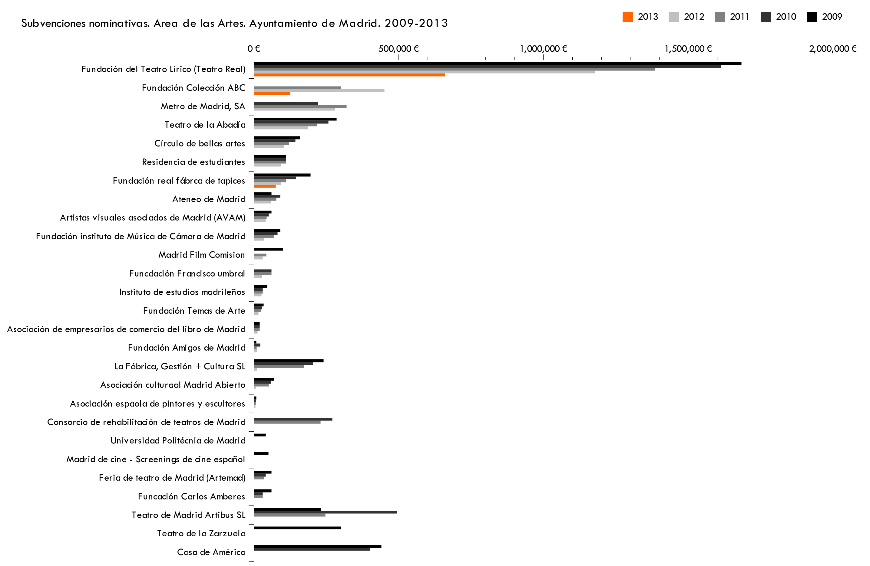
This is the csv used in this examples:
Instituciones,2013,2012,2011,2010,2009

"Fundación del Teatro Lírico (Teatro Real)",659295,1177314,1385075,1612901,1684250

"Fundación Colección ABC",125000,450000,300000,0,0

"Fundación real fábrca de tapices",75000,93500,110000,145000,195000

"Casa de América",0,0,0,401385,439825

"Teatro de la Zarzuela",0,0,0,0,300500

"Teatro de Madrid Artibus SL",0,0,246421,492842,230300

"Funcación Carlos Amberes",0,0,30000,30000,60000

"Feria de teatro de Madrid (Artemad)",0,0,34000,40000,60000

"Madrid de cine - Screenings de cine español",0,0,0,0,50000

"Universidad Politécnia de Madrid",0,0,0,0,40000

"Consorcio de rehabilitación de teatros de Madrid",0,0,229500,270000,0

"Asociación espaola de pintores y escultores",0,5000,5636,6630,7800

"Asociación culturaal Madrid Abierto",0,6000,50575,59500,70000

"La Fábrica, Gestión + Cultura SL",0,100000,173400,204000,240000

"Fundación Amigos de Madrid",0,10000,9000,21000,8000

"Asociación de empresarios de comercio del libro de Madrid",0,12000,19000,19000,19000

"Fundación Temas de Arte",0,15000,23849,28057,33008

"Instituto de estudios madrileños",0,25500,30000,30000,45000

"Funcdación Francisco umbral",0,28000,60000,60000,0

"Madrid Film Comision",0,30000,42500,0,100000

"Fundación instituto de Música de Cámara de Madrid",0,35000,68580,81000,90000

"Artistas visuales asociados de Madrid (AVAM)",0,40000,43350,51000,60000

"Ateneo de Madrid",0,59000,77000,90000,60000

"Residencia de estudiantes",0,93500,110000,110000,110000

"Círculo de bellas artes",0,102842,120991,142343,158158

"Teatro de la Abadía",0,185364,218075,256559,285065

"Metro de Madrid, SA",0,280000,320000,220000,0
Madeleine says:
I’ve done a number of these… these are mostly too time-consuming. You should try gnumeric, in my experience it’s far better than libreoffice at charts.
p says:
True! I’ll include Gnumeric in the comparison. Highly customizable, clean and easy to export to inkscape to finish the editing.
Thanks Madeleine.